


Title
Description
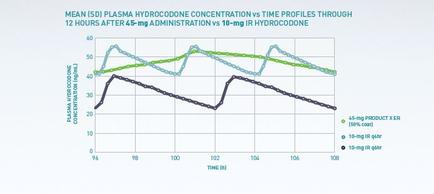
This is a run chart with Time on the x-axis and Plasma hydrocodone concentration on the y-axis. It shows that Product X keeps plasma hydrocodone concentration both higher and more stable than the 2 competing products (both forms of IR hydrocodone at different dosages).
Type 
Category
-
Date
2015
Collection
We encourage you to view the image in the context of its source document(s) and cite the source(s) when using these images. However, to cite just this image alone, click the “Cite This Image” button and then paste the copied text.


![A screenshot of part of the homepage of the website for the One and Only Campaign with the tagline "1 : One Needle One Syringe Only One Time". There is a menu bar at the top with at least 7 options. The left of the image reads : "Only once. Safe injection practices are a set of measures to perform injections in an optimally safe manner for patients healthcare providers and others. Learn about Safe Injection Practices [clickable hyperlink]." The right of the image provides information About the Campaign including a Training Video. There are photographs of 3 different healthcare professionals throughout. The background is white with graphic elements in blue and gray with text in black blue and white.](https://oida-resources-images.azureedge.net/public/full/a955418e-015b-4501-9efc-3dd5ded7d992.png)