Title
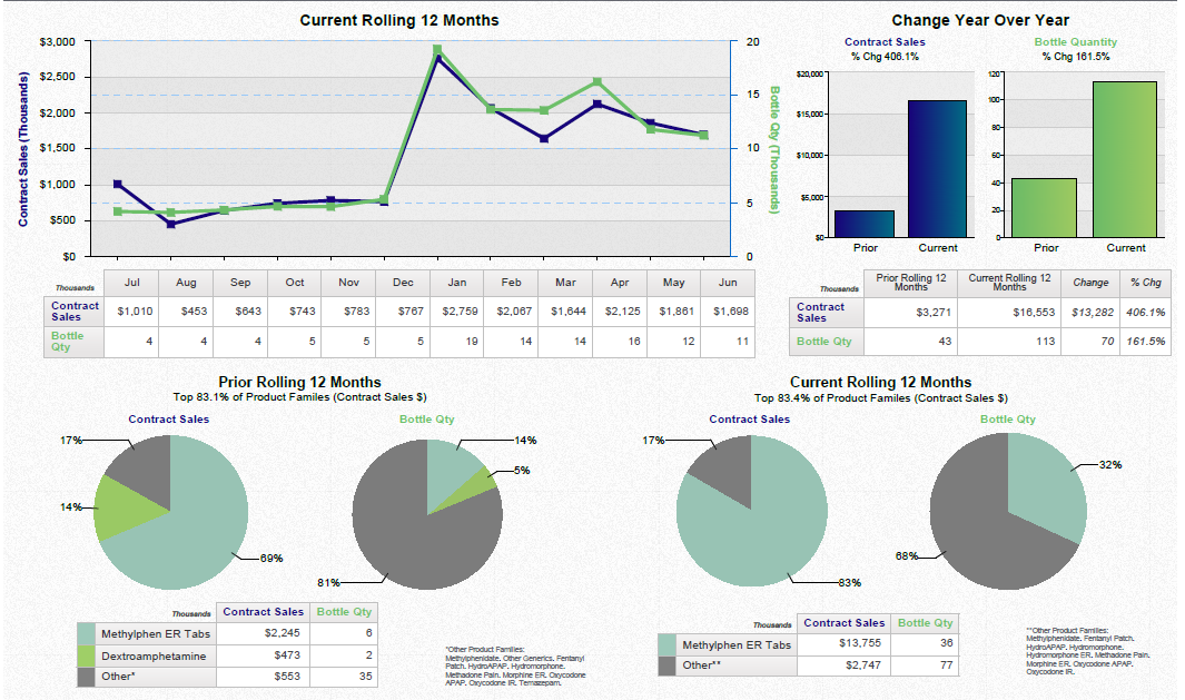
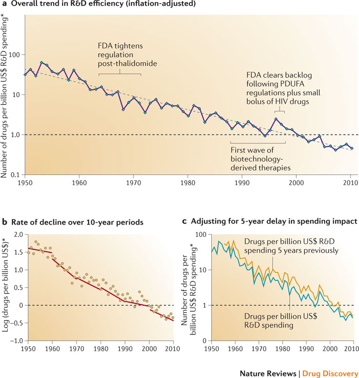
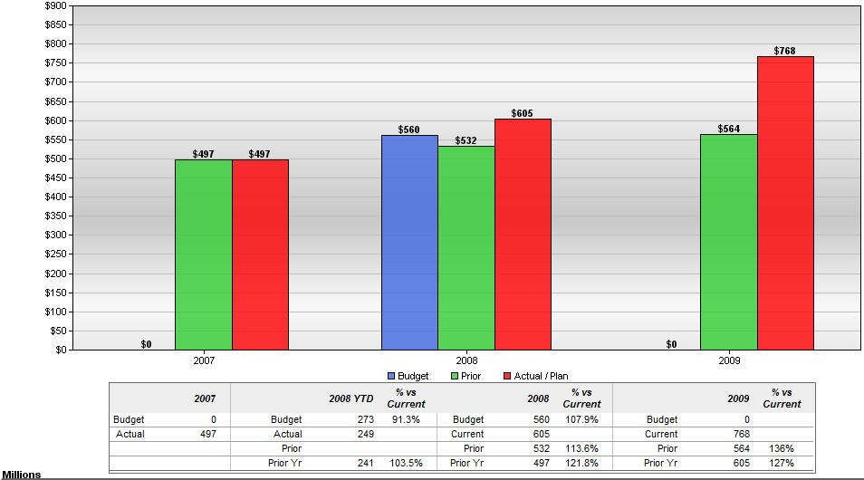
A bar graph that shows the budgeted expenses for a company from 2007 to 2009. The x-axis represents the years starting from 2007 and ending in 2009 with the y-axis representing the amount of expenses.
There are six bars in the graph each representing a different year. The first bar is red the second is green the third is blue the fourth is orange the fifth is purple and the sixth is yellow. The bars are arranged in a horizontal axis with each bar representing a year.
Various bars represent years between 2007 and 2022.
Category
-
Date
2010
Collection
We encourage you to view the image in the context of its source document(s) and cite the source(s) when using these images. However, to cite just this image alone, click the “Cite This Image” button and then paste the copied text.


