Title
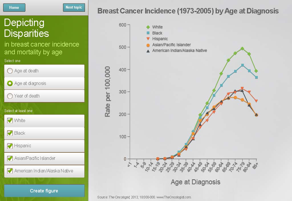
A line graph that shows the percentage of breast cancer incidence in the United States from 1973-2005 by age at diagnosis. The x-axis represents the years from 1973 to 2005 with the y-axis representing the age range.
The graph is divided into three sections. The first section is titled "Depicting Disparities in Breast Cancer Incidence and Mortality by Age" and has a title that reads "Age at Diagnosis". The second section is labeled "Age of Death" and shows a decrease in the number of deaths in each age group. The third section has a line that shows an increase in the percentage over time. The line is colored in orange blue and green representing the percentage change in the age groups. The graph also has a legend that explains the meaning of each color in the graph. The background of the graph is white and there is a green button at the bottom that says "Create figure".
Source 1 of 2
-
Date
2011
Collection
-
Date
2011
Collection
We encourage you to view the image in the context of its source document(s) and cite the source(s) when using these images. However, to cite just this image alone, click the “Cite This Image” button and then paste the copied text.

