Title
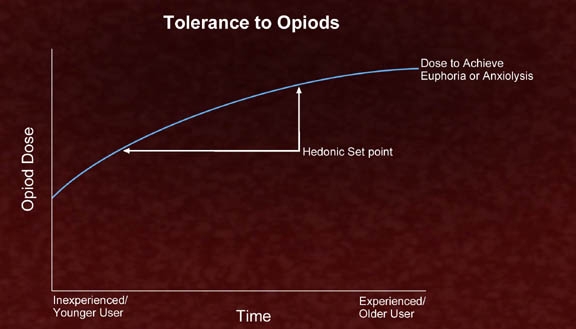
A graph that shows the relationship between the tolerance to Opioids and the Hedonic Set point. The x-axis of the graph represents the time period while the y-axis represents the dose to achieve euphoria or anxiety.
There are two lines on the graph one labeled "Opioid Dose" and the other labeled "Dose to Achieve Euphoria or Anxiety". The line on the left represents the experienced/ Younger User which is represented by a blue curve. The line in the middle represents the hedonic set point which represents the expected/ experienced/ older user. The graph also has a red arrow pointing to the left indicating the direction of the dose. The background of the image is maroon in color.
Category
Source 1 of 3
-
Date
2011
Collection
-
Date
2005
Collection
-
Date
2010
Collection
We encourage you to view the image in the context of its source document(s) and cite the source(s) when using these images. However, to cite just this image alone, click the “Cite This Image” button and then paste the copied text.


