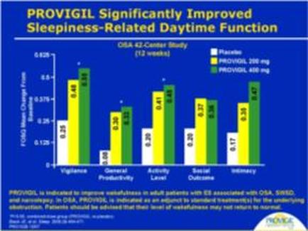
A bar graph that shows the percentage of patients who have been diagnosed with prodigal (prodigal) significantly improved sleepiness-related daytime function. The x-axis of the graph is labeled with the title "prodigal significantly Improved Sleepiness-Related Daytime Function" and the y-axis is labeled as "DSA 42-Century Study (12 weeks)". There are six bars in the graph each representing a different period of time. The first bar is green the second is yellow the third is orange the fourth is yellow and the fifth is red the sixth is purple and the seventh is orange. The bars are arranged in a horizontal axis with the highest bar at the top and the lowest at the bottom. The first bar on the left shows that the majority of the bars are green indicating that the percentage is higher than the other bars. The second bar shows that there is a higher percentage of the percentage while the third and fourth bars are yellow. The fifth bar shows a lower percentage indicating a higher level of satisfaction. The sixth bar shows an increase in the percentage. The seventh bar shows the lowest percentage with a higher number of people who have experienced a decrease in their sleepiness. The eighth bar shows how the percentage has decreased with an increase of 0.5% in the last few days. The ninth bar shows what percentage has been improved with some areas having a higher rate of satisfaction and others having a lower rate. The tenth bar shows where the percentage appears to be higher than those who are experiencing a decrease. The eleventh and final bars show a decrease with no percentage being higher than others.
Description 
Type
Category
Source 1 of 2
-
Date
2010
Collection
-
Date
2010
Collection
We encourage you to view the image in the context of its source document(s) and cite the source(s) when using these images. However, to cite just this image alone, click the “Cite This Image” button and then paste the copied text.