OIDA Image Collection
Filters:
Reset 
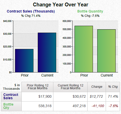
A business review summary for Armada Health Care. It is divided into three sections.<br /><br />The top section is titled "Business Review Summary" and has a title that reads "Current Rolling 12 Months". Below the title there is a line graph that shows the current rolling 12 months of the company's health care system. The line graph shows a steady increase in the number of patients who have been diagnosed with cancer over the past 12 months. The graph also shows a bar graph that represents the percentage of patients with cancer in each month. <br /><br />Below the graph there are three pie charts that show the current year-to-date changes in the company. The first chart shows that the company has experienced a significant increase in its current year while the second chart shows a decrease in the percentage. The third chart shows the percentage change in the previous year with the highest percentage being in the first quarter of the year and the lowest percentage being on the second half of the third quarter. The fourth chart shows an increase in percentage change with a slight decrease in percentage changes. The fifth chart shows two pie charts one in blue and the other in green that show a decrease of percentage changes over the next few months.

Title

Business Review Summary (Generic Pharmaceuticals) : Armada Health Care (for January through July 2013 vs. January through July 2014)

Description Generated using AI

A business review summary for Armada Health Care. It is divided into three sections.

The top section is titled "Business Review Summary" and has a title that reads "Current Rolling 12 Months". Below the title there is a line graph that shows the current rolling 12 months of the company's health care system. The line graph shows a steady increase in the number of patients who have been diagnosed with cancer over the past 12 months. The graph also shows a bar graph that represents the percentage of patients with cancer in each month.

Below the graph there are three pie charts that show the current year-to-date changes in the company. The first chart shows that the company has experienced a significant increase in its current year while the second chart shows a decrease in the percentage. The third chart shows the percentage change in the previous year with the highest percentage being in the first quarter of the year and the lowest percentage being on the second half of the third quarter. The fourth chart shows an increase in percentage change with a slight decrease in percentage changes. The fifth chart shows two pie charts one in blue and the other in green that show a decrease of percentage changes over the next few months.

We encourage you to view the image in the context of its source document(s) and cite the source(s) when using these images. However, to cite just this image alone, click the “Cite This Image” button and then paste the copied text.

Information copied to your clipboard:

"Business Review Summary (Generic Pharmaceuticals) : Armada Health Care (for January through July 2013 vs. January through July 2014)." OIDA Image Col...