Title
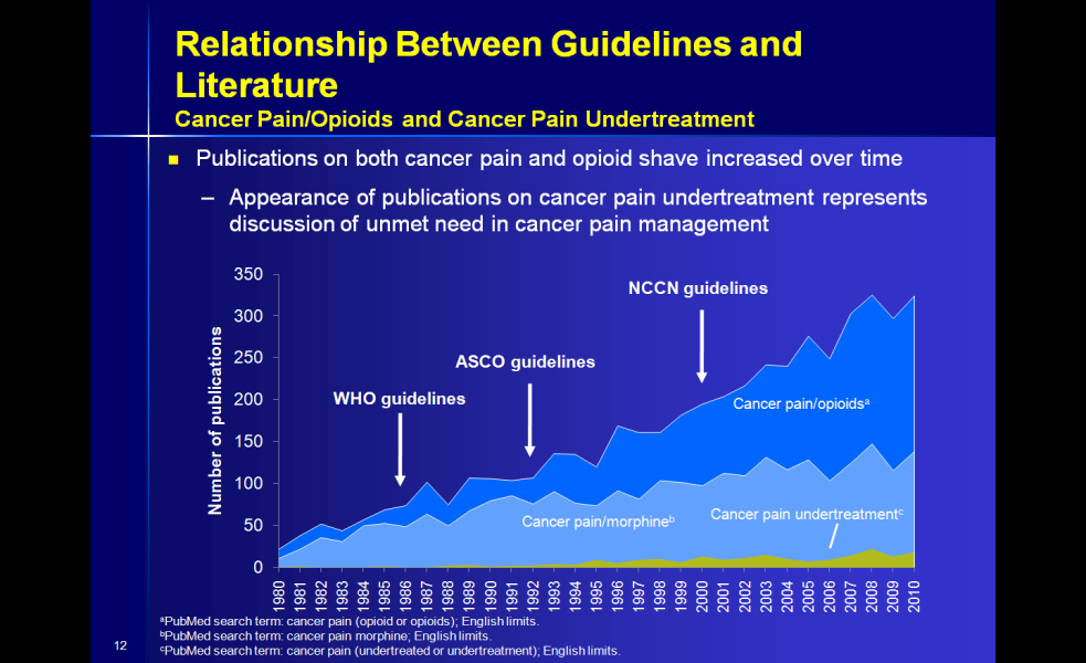
A line graph that shows the relationship between guidelines and literature for cancer pain/opioids and cancer pain undertreatment. The x-axis represents the number of publications on both cancer pain and opioid shave increased over time while the y-axis shows the percentage of publications that have been published over time.
The graph is divided into three sections each representing a different period of time. The first section is titled "Relationship Between Guidelines and Literature" and shows that publications on the left side of the graph have increased over the past few years with the highest percentage being around 350 publications and the lowest being around 250 publications. The second section is labeled "Who guidelines" and has a blue line representing the WHO guidelines. The third section has a green line representing CANCER pain/OPIOIDS. The fourth section has an orange line representing NCCN guidelines.
Overall the graph is a visual representation of the differences between the two types of guidelines and how they can be used to improve the overall health and wellbeing of those affected by cancer pain.
Category
-
Date
2013
Collection
We encourage you to view the image in the context of its source document(s) and cite the source(s) when using these images. However, to cite just this image alone, click the “Cite This Image” button and then paste the copied text.


