Title
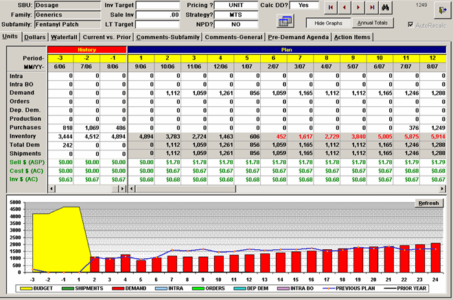
A screenshot of a spreadsheet in Microsoft Excel. The spreadsheet is divided into three columns and three rows. The first column is labeled "SUBU" and the second column is titled "Product Description".
The first row of the spreadsheet has a table with three columns - "Product" "Description" and "Description". The table has three rows - the first row has a list of items the second row has two columns and the third row has three columns.
At the top of the table there is a menu bar with options such as "File" "Edit" "View" "Tools" "Help" "Options" "Cancel" "Save" "Print" "Format" "Export" "Analyze" etc. Below the menu bar there are two buttons - "Save" and "Help".
In the bottom left corner of the image there appears to be a graph or chart that shows the performance of a product over time. The graph is colored in red and yellow with the red line representing the product's performance and the yellow line representing its price. The chart also has a bar graph at the bottom which shows the price of the product over a period of time.
Category
-
Date
2006
Collection
We encourage you to view the image in the context of its source document(s) and cite the source(s) when using these images. However, to cite just this image alone, click the “Cite This Image” button and then paste the copied text.


