


Title
Description
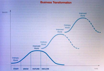
This is a pseudo-run chart describing the effect of Business transformation cycles (on the x-axis) on Sales (on the y-axis). It posits the each business transformation cycles creates an Improved world as it Matures which then becomes the Ordinary world that the next Business transformation cycle Starts from. This yields arithmetically increasing Sales growth over time in an ever-improving world.
Type 
Category
Source 1 of 2
-
Date
2014
Collection
-
Date
2014
Collection
We encourage you to view the image in the context of its source document(s) and cite the source(s) when using these images. However, to cite just this image alone, click the “Cite This Image” button and then paste the copied text.