


Title
Description
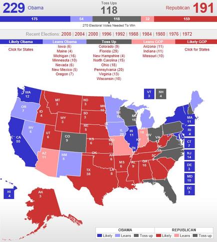
This is an undated map of the United States color-coded to indicate whether individual states are likely to vote for incumbent Democratic President Barack Obama (and his running mate incumbent Vice President Joe Biden) or the eventual Republican Party candidates (which were not chosen until April 25 2012). States are listed as Likely Obama (Blue) Leans Obama (Light Blue) Toss Up (Gray) Leans GOP (Light Red) or Likely GOP (Red). President Obama was credited with 229 presumptive electoral votes at this point as compared to 191 presumptive electoral votes for the Republicans and 118 presumptive electoral votes in swing states.
Type 
Category
-
Date
2012
Collection
We encourage you to view the image in the context of its source document(s) and cite the source(s) when using these images. However, to cite just this image alone, click the “Cite This Image” button and then paste the copied text.