OIDA Image Collection
Filters:
Reset 
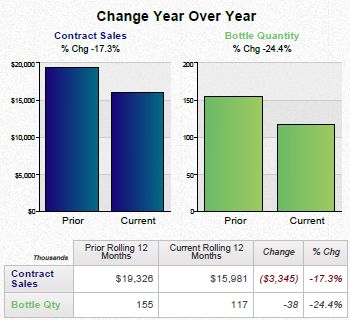
A bar graph that shows the change year over year for contract sales and bottle quantity. The x-axis of the graph is labeled "Contract Sales" and the y-axis is labeled as "Bottle Quantity". <br /><br />There are three bars in the graph each representing a different year. The first bar is blue the second is green and the third is yellow. The blue bar represents the price of a contract the green bar represents a price of $15000 the yellow bar represents $10000.<br /><br />The first bar on the graph shows that the contract sales have increased in the first quarter of the year with a slight increase in the price. The second bar shows the current price of the contract which is $19326 in the second quarter and a slight decrease in the third quarter. The third bar shows a decrease of the price in the fourth quarter but the price has decreased from $15 to $3345 in the fifth quarter.<br />- The graph also has a legend at the bottom that explains the meaning of each bar. The text at the top of the image reads "Change Year Over Year" and "Bottles Quantity".

Title

Data visualizations for Contract Sales and Bottle Quantity : Change Year over Year Prior rolling 12 months Current rolling 12 months (July to June) etc. (dates and products not specified)

Description Generated using AI

A bar graph that shows the change year over year for contract sales and bottle quantity. The x-axis of the graph is labeled "Contract Sales" and the y-axis is labeled as "Bottle Quantity".

There are three bars in the graph each representing a different year. The first bar is blue the second is green and the third is yellow. The blue bar represents the price of a contract the green bar represents a price of $15000 the yellow bar represents $10000.

The first bar on the graph shows that the contract sales have increased in the first quarter of the year with a slight increase in the price. The second bar shows the current price of the contract which is $19326 in the second quarter and a slight decrease in the third quarter. The third bar shows a decrease of the price in the fourth quarter but the price has decreased from $15 to $3345 in the fifth quarter.
- The graph also has a legend at the bottom that explains the meaning of each bar. The text at the top of the image reads "Change Year Over Year" and "Bottles Quantity".

We encourage you to view the image in the context of its source document(s) and cite the source(s) when using these images. However, to cite just this image alone, click the “Cite This Image” button and then paste the copied text.
Information copied to your clipboard:

"Data visualizations for Contract Sales and Bottle Quantity : Change Year over Year Prior rolling 12 months Current rolling 12 months (July to June) ...