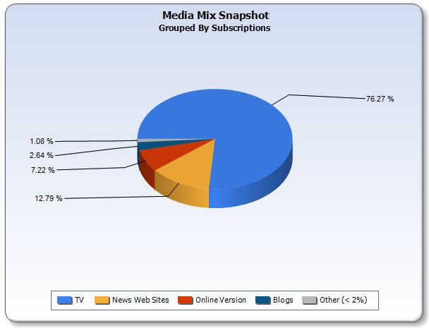
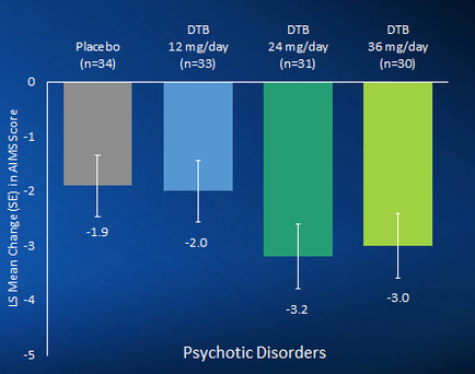
OIDA Image Collection
Filters:
Reset 
A bar graph that shows the mean change in the number of psychiatric disorders in the United States. The x-axis of the graph is labeled "Placebo" and the y-axis is labeled as "Psychotic Disorders". There are three bars in the graph each representing a different type of psychiatric disorder. The first bar is labeled with the name "DTB" and has a value of "n=34". The second bar is labelled with "12 mg/day" and contains the value of n=33. The third bar has the value "24 mg/days" and is labeled in "n =31". The fourth bar has "DtB" and "36 mg/Day" respectively. The graph shows that there are three different types of disorders - Placebo DTB and DTB - represented by the bars. The Placebo is represented by a gray rectangle the DTB is shown in a blue rectangle and the DTD is shown as a green rectangle. The DTB and DTD are represented by two bars one in green and one in blue. The green rectangle represents the percentage of people who have been diagnosed with psychiatric disorders while the blue rectangle represents a percentage of those who have experienced psychiatric disorders. The graph also has a label that reads "3.2 - 3.0". Overall the graph shows a decrease in the mean changes in psychiatric disorders over time.

Description Generated using AI

A bar graph that shows the mean change in the number of psychiatric disorders in the United States. The x-axis of the graph is labeled "Placebo" and the y-axis is labeled as "Psychotic Disorders". There are three bars in the graph each representing a different type of psychiatric disorder. The first bar is labeled with the name "DTB" and has a value of "n=34". The second bar is labelled with "12 mg/day" and contains the value of n=33. The third bar has the value "24 mg/days" and is labeled in "n =31". The fourth bar has "DtB" and "36 mg/Day" respectively. The graph shows that there are three different types of disorders - Placebo DTB and DTB - represented by the bars. The Placebo is represented by a gray rectangle the DTB is shown in a blue rectangle and the DTD is shown as a green rectangle. The DTB and DTD are represented by two bars one in green and one in blue. The green rectangle represents the percentage of people who have been diagnosed with psychiatric disorders while the blue rectangle represents a percentage of those who have experienced psychiatric disorders. The graph also has a label that reads "3.2 - 3.0". Overall the graph shows a decrease in the mean changes in psychiatric disorders over time.

We encourage you to view the image in the context of its source document(s) and cite the source(s) when using these images. However, to cite just this image alone, click the “Cite This Image” button and then paste the copied text.

Information copied to your clipboard:

"A bar graph that shows the mean change in the number of psychiatric disorders in the United States. The x-axis of the graph is labeled "Placebo&...