


Title
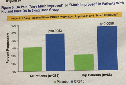
OA pain "very much improved" or "much improved" in patients with hip and knee OA in 5-mg dose group
Description
This is two bar graphs showing that patients who are prescribed the 5-mg dosage of CR845 are significantly more likely to self-report that their OA (osteoarthritis) pain is "very much improved" or "much improved" when compared to the placebo. All patients are over 45% likely to claim such improvement (vs. 30% for the placebo) and Hip patients are over 55% likely to claim such improvement (vs. 20% for the placebo).
Type 
Category
-
Date
2017
Collection
We encourage you to view the image in the context of its source document(s) and cite the source(s) when using these images. However, to cite just this image alone, click the “Cite This Image” button and then paste the copied text.