Title
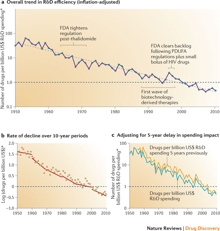
A line graph that shows the overall trend in R&D efficiency (inflation-adjusted) for the United States from 1950 to 2010. The x-axis represents the years starting from 1950 and ending in 2010 with the y-axis representing the rate of decline over 10-year periods.
There are three lines in the graph each representing a different period of time. The first line is for the first wave of biotechnology-derived therapies which is the first step in the treatment of HIV/AIDS. The second line is from 1950 which shows that the FDA tightens the regulation of post-thalidomide followed by the FDA clears backlog following PDUFA regulations plus small doses of HIV drugs. The third line is in 2010 and shows that drugs per billion US$ spending is steadily increasing over the years. The graph also shows that adjusting for 5-year delay in spending impact is a significant factor in the overall effect of the FDA's efforts to reduce the number of drugs in the US$ over the past 10 years.
Category
-
Date
2016
Collection
We encourage you to view the image in the context of its source document(s) and cite the source(s) when using these images. However, to cite just this image alone, click the “Cite This Image” button and then paste the copied text.


