Title
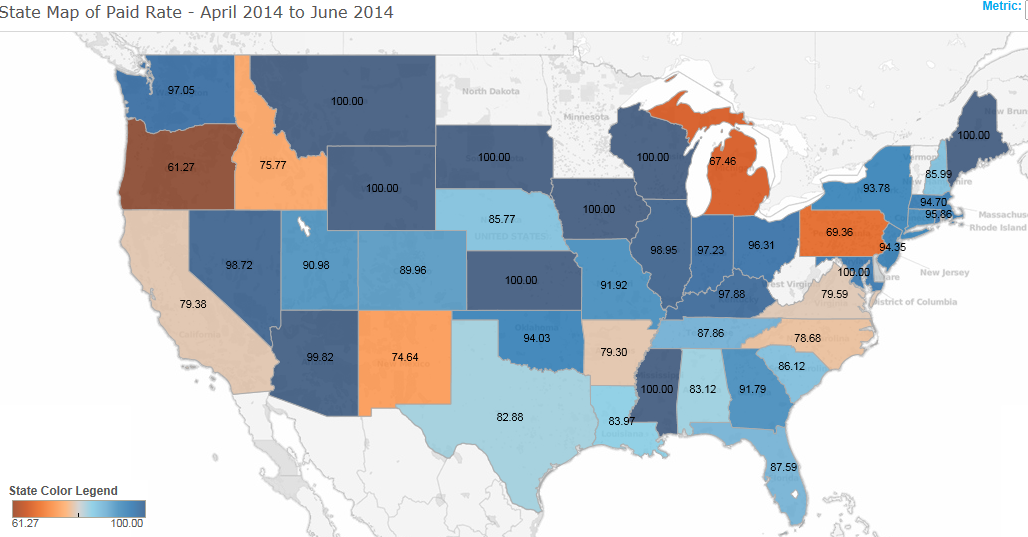
A map of the United States showing the state of paid rate from April 2014 to June 2014. The map is color-coded with each state represented by a different color - blue orange and light blue. The states are arranged in a grid-like pattern with the blue states on the left the orange states in the middle and the light blue ones on the right.
The map also shows the percentage of paid rates in each state ranging from 0.5% to 100%. The blue states have a higher percentage of the paid rate while the orange state has a lower percentage. The orange states also have a lower rate with a higher rate of 100%.
Overall the map shows that the state has the highest paid rate in April 2014 with some states having the lowest paid rate and others having the least paid rate.
Type
Category
Source 1 of 3
-
Date
2014
Collection
-
Date
None
Collection
-
Date
2014
Collection
We encourage you to view the image in the context of its source document(s) and cite the source(s) when using these images. However, to cite just this image alone, click the “Cite This Image” button and then paste the copied text.


![A screenshot of part of the homepage of the website for the One and Only Campaign with the tagline "1 : One Needle One Syringe Only One Time". There is a menu bar at the top with at least 7 options. The left of the image reads : "Only once. Safe injection practices are a set of measures to perform injections in an optimally safe manner for patients healthcare providers and others. Learn about Safe Injection Practices [clickable hyperlink]." The right of the image provides information About the Campaign including a Training Video. There are photographs of 3 different healthcare professionals throughout. The background is white with graphic elements in blue and gray with text in black blue and white.](https://oidaresourcesimages-cdn-endpoint-duhwc2gse6gdbng7.a01.azurefd.net/public/full/a955418e-015b-4501-9efc-3dd5ded7d992.png)
