Title
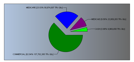
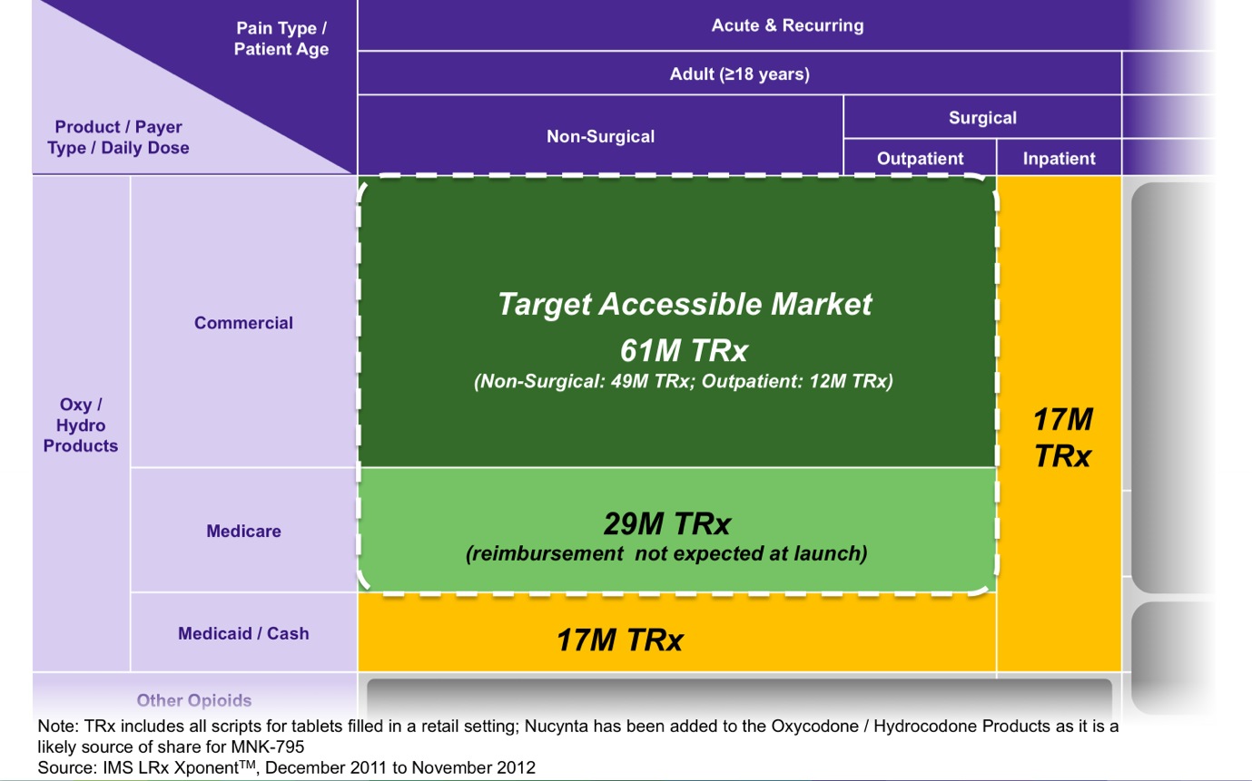
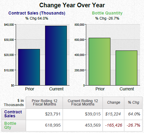
A bar graph that shows the change year over year for contract sales and bottle quantity. The x-axis of the graph is labeled "Contract Sales" and the y-axis is labeled as "Bottle Quantity".
There are three bars in the graph each representing a different year. The first bar is blue the second is green and the third is orange. The blue bar represents the number of contract sales in thousands the green bar represents a percentage change in the price of a bottle the orange bar represents an increase in the quantity of the bottle and finally the yellow bar represents another percentage change.
The graph shows that contract sales have increased from $40000 to $20000 in thousands in the first quarter of the year with the highest percentage change occurring in the second quarter. The third bar is orange the fourth bar is green and the fifth bar is yellow the sixth bar is purple the seventh bar is pink the eighth bar is red the ninth bar is gray the tenth bar is white the eleventh bar is black the twelfth bar is light blue and all three bars are colored in shades of green. The graph also has a legend at the bottom that explains the meaning of each bar.
Category
Source 1 of 4
-
Date
2014
Collection
-
Date
2014
Collection
-
Date
2014
Collection
-
Date
2014
Collection
We encourage you to view the image in the context of its source document(s) and cite the source(s) when using these images. However, to cite just this image alone, click the “Cite This Image” button and then paste the copied text.
