Title
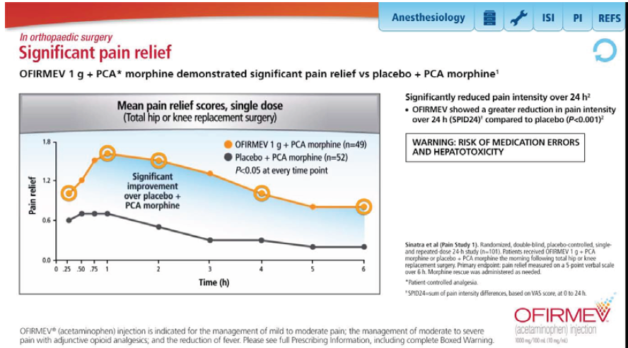
A line graph that shows the mean pain relief scores for different types of pain relief. The x-axis of the graph is labeled "Significant pain relief" and the y-axis is labeled as "Mean pain relief score". The line graph shows that the mean and mean pain scores are significantly reduced in pain intensity over 24 hours.
There are two lines in the graph one in orange and one in blue. The orange line represents pain relief while the blue line represents inflammation. The line in orange represents inflammation and the line in blue represents pain improvement. The graph also has a legend that explains the meaning of each line. The text on the right side of the image provides information about the risk of medication errors and the potential risks associated with the treatment.
Category
-
Date
2014
Collection
We encourage you to view the image in the context of its source document(s) and cite the source(s) when using these images. However, to cite just this image alone, click the “Cite This Image” button and then paste the copied text.
