Title
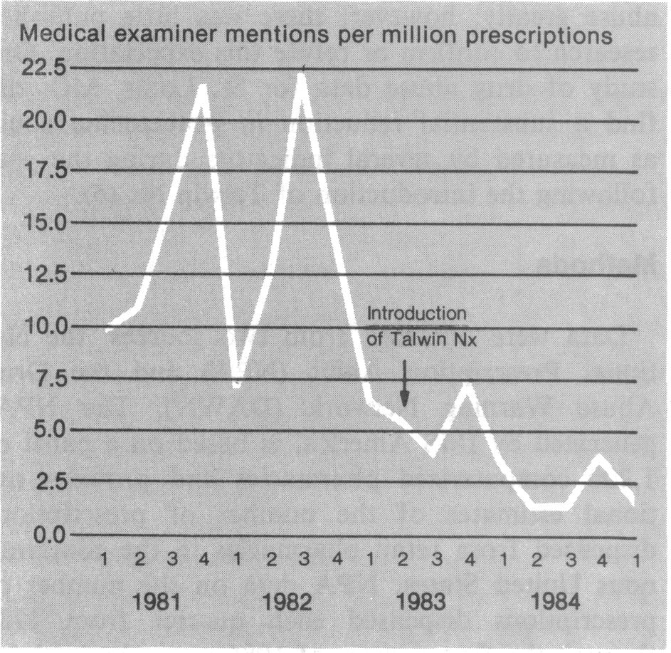
A line graph that shows the number of medical examiner mentions per million prescriptions in the United States from 1981 to 1984. The x-axis represents the years starting from 1981 and ending in 1984 with the y-axis representing the amount of prescriptions.
The graph has a vertical axis representing the number in millions of prescriptions ranging from 22.5 to 17.5. The line graph shows a steady increase in the number with a slight decline in the percentage of prescriptions over the years. The graph also has a horizontal axis representing an introduction of Talwin Nx which is represented by an arrow pointing downwards. The title of the graph is written in black text at the top of the image.
Category
-
Date
2011
Collection
We encourage you to view the image in the context of its source document(s) and cite the source(s) when using these images. However, to cite just this image alone, click the “Cite This Image” button and then paste the copied text.


