


Title
Description
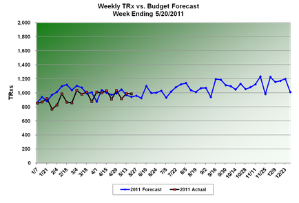
This is a run chart showing the 2011 actual TRx (for January 1 2011-May 20 2011) and the 2011 forecast TRx (for January 11 2011-December 31 2011) of an unidentified drug.The trend is that the acutal TRx was always below the forecast TRx for January through March 2011 but the acutal TRx has often exceeded the forecast TRx in April and May 2011. The forecast TRx is expected to increase steadily between June 2011 and December 2011.
Type 
Category
Source 1 of 2
-
Date
2011
Collection
-
Date
2011
Collection
We encourage you to view the image in the context of its source document(s) and cite the source(s) when using these images. However, to cite just this image alone, click the “Cite This Image” button and then paste the copied text.