Title
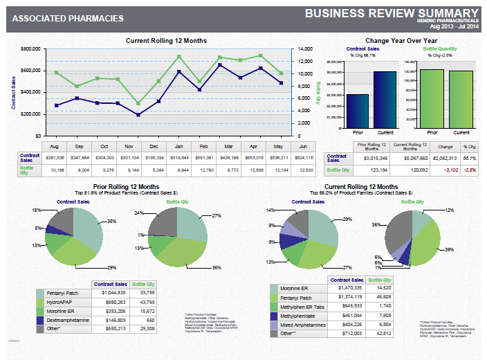
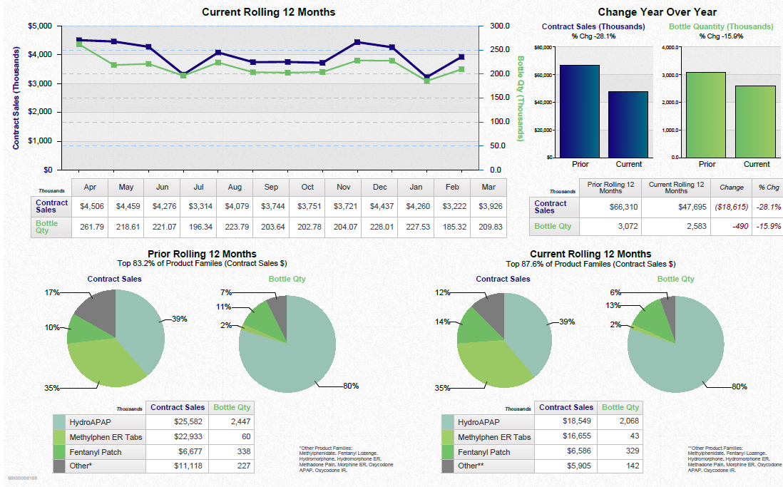
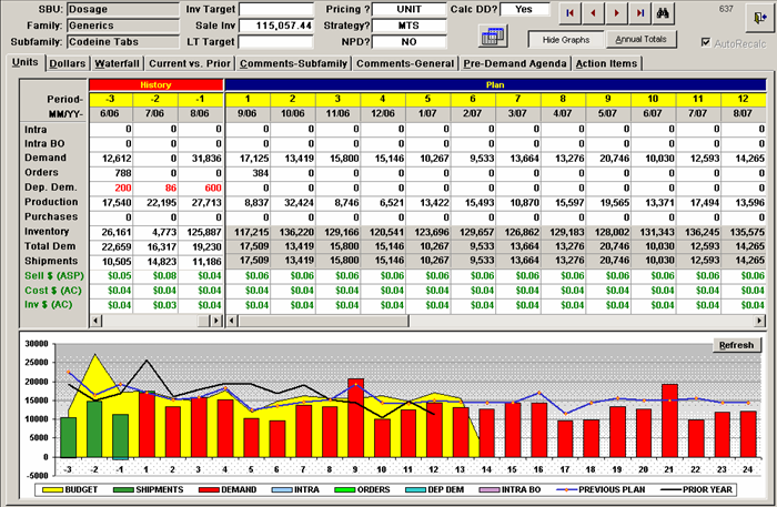
A screenshot of a financial report in Microsoft Excel. The report is divided into two sections. The top section is titled "Financial Report" and has a table with columns and rows. The table has three columns each representing a different aspect of the financial report.
The first column is labeled "Inventory" and shows the total number of items in the report while the second column has a list of items that have been sold. The items are listed in a table format with columns for the date time and price. The first column shows the quantity of items sold the second row shows the price of the items and the third row shows a line graph with different colors representing the different levels of sales. The graph shows that the report has been steadily increasing over time with the highest percentage of sales being in the first quarter of the year and the lowest percentage being in a third quarter.
- The bottom section of the report shows a bar graph with three bars each with a different color - red yellow and green. The bars are labeled "Budget" "Orders" and "Previous Plan". The graph also has a legend at the bottom that explains the meaning of each bar.
Category
-
Date
2006
Collection
We encourage you to view the image in the context of its source document(s) and cite the source(s) when using these images. However, to cite just this image alone, click the “Cite This Image” button and then paste the copied text.
