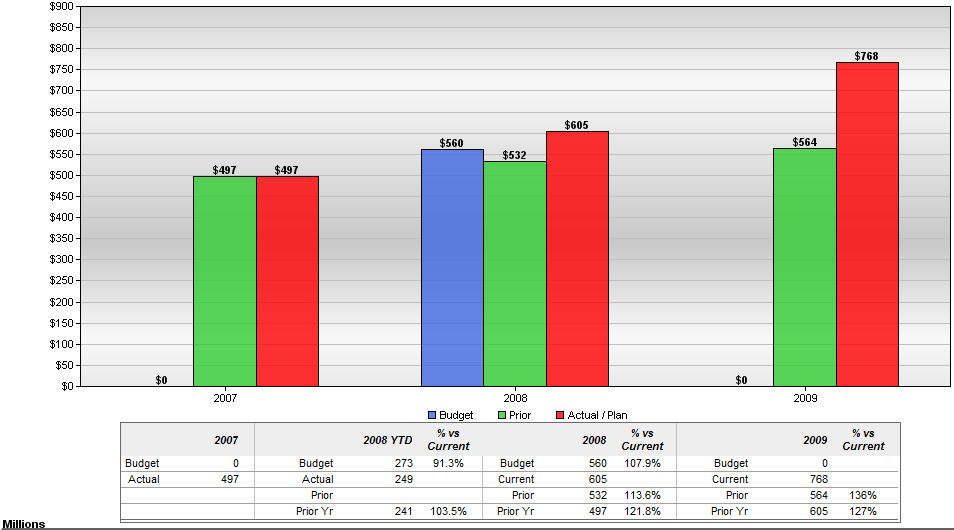
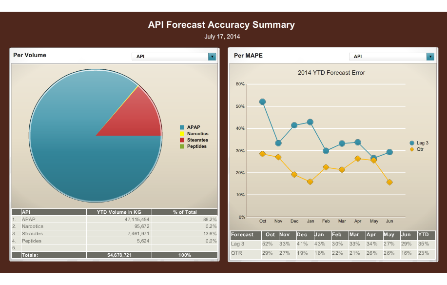
A screenshot of the API Forecast Accuracy Summary page on July 17 2014. It shows two graphs side by side.
The first graph on the left is a pie chart that shows the percentage of API volumes in the United States. The pie chart is divided into three sections - the largest section is blue the smallest section is red and the largest is green. The largest section has a percentage of the total API volumes with the highest percentage being the highest and the lowest being the lowest.
On the right side of the image there is a line graph that shows a 2014 YTD forecast error. The line graph has three lines each representing a different period of time. The first line is yellow the second line is orange the third line is blue and the fourth line is green the fifth line is red and the sixth line is purple. The graph shows that the API has experienced a significant increase in the number of YTD volumes over the years with a slight decrease in the percentage. The data is presented in a table format with columns for the total number of volumes volume and total.
Category
-
Date
2014
Collection
We encourage you to view the image in the context of its source document(s) and cite the source(s) when using these images. However, to cite just this image alone, click the “Cite This Image” button and then paste the copied text.
