


Title
Description
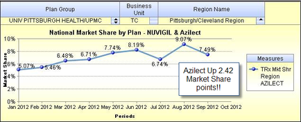
This is a run chart with Periods on the x-axis (from January 2012 to October 2012) and Market Share on the y-axis (from 0% to 10%). It shows the National Market Share by Plan for Nuvigil & Azilect for the University of Pittsburgh Health/UPMC plan group for the TC business unit for the Pittsburgh/Cleveland Region. The trend shows market share steadily increasing from January 2012 to May 2012 then going up and down between June 2012 and August 2012.
Type 
Category
-
Date
2014
Collection
We encourage you to view the image in the context of its source document(s) and cite the source(s) when using these images. However, to cite just this image alone, click the “Cite This Image” button and then paste the copied text.