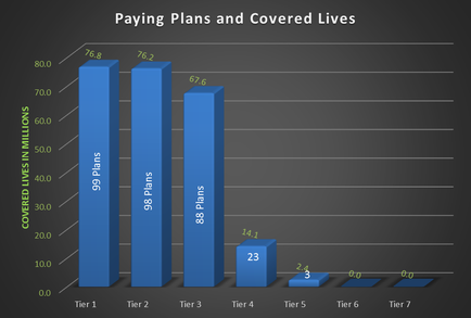
OIDA Image Collection
Filters:
Reset 
A bar graph that shows the number of paying plans and covered lives in millions. The x-axis of the graph is labeled "Paying Plans and Covered Lives" and the y-axis is labeled as "Covered Lives in Millions". There are four bars in the graph each representing a different type of paid plan. The first bar on the graph shows that the paid plans are higher than the covered lives with the highest paid plans being the highest. The second bar shows that 99 plans are lower than the other two. The third bar shows the lowest paid plans with 88 plans being higher than 23. The fourth bar shows a higher paid plan with a lower paid plan being the lowest. The fifth bar shows an increase in paid plans from 0.0 to 0.1. The sixth bar shows two tiers Tier 1 and Tier 2 with Tier 3 and Tier 4 being the smallest. The seventh bar shows three tiers - Tier 5 and Tier 6. The eighth bar shows four tiers - tier 7 and tier 8. The ninth bar shows five tiers - tiers 1 tier 8 tier 9 tier 10 tier 11 tier 12 tier 13 tier 14 tier 15 tier 16 tier 17 tier 18 tier 19 tier 20 tier 21 tier 22 tier 23 tier 24 tier 25 tier 26 tier 27 tier 28 tier 29 tier 30 tier 31 tier 32 tier 33 tier 34 tier 35 tier 36 tier 37 tier 38 tier 39 tier 40 tier 41 tier 42 tier 43 tier 44 tier 45 tier 46 tier 47 tier 48 tier 49 tier 50 tier 51 tier 52 tier 53 tier 54 tier 55 tier 56 tier 57 tier 58 tier 59 tier 60 tier 61 tier 62 tier 73 tier 74 tier 75 tier 76 tier 77 tier 78 tier 79 tier 80 tier 81 tier 82 tier 83 tier 84 tier 85 tier 86 tier 87 tier 88 tier 89 tier 90 tier 91 tier 92 tier 93 tier 94 tier 95 tier 96 tier 97 tier 98 tier 99 tier 100 tier 110 tier 115 tier 116 tier 117 tier 122 tier 130 tier 129 tier 126 tier 131 tier 132 tier 133 tier 134 tier 135 tier 136 tier 175 tier 151 tier 152 tier 158 tier 159 tier 170 tier 171 tier 172 tier 183 tier 184 tier 179 tier 190 tier 191 tier 230 tier 222 tier 235 tier 226 tier 227 tier 229 tier 260 tier 231 tier 232 tier 247 tier 251 tier 255 tier 258 tier 262 tier 237 tier 239 tier

Description Generated using AI

A bar graph that shows the number of paying plans and covered lives in millions. The x-axis of the graph is labeled "Paying Plans and Covered Lives" and the y-axis is labeled as "Covered Lives in Millions". There are four bars in the graph each representing a different type of paid plan. The first bar on the graph shows that the paid plans are higher than the covered lives with the highest paid plans being the highest. The second bar shows that 99 plans are lower than the other two. The third bar shows the lowest paid plans with 88 plans being higher than 23. The fourth bar shows a higher paid plan with a lower paid plan being the lowest. The fifth bar shows an increase in paid plans from 0.0 to 0.1. The sixth bar shows two tiers Tier 1 and Tier 2 with Tier 3 and Tier 4 being the smallest. The seventh bar shows three tiers - Tier 5 and Tier 6. The eighth bar shows four tiers - tier 7 and tier 8. The ninth bar shows five tiers - tiers 1 tier 8 tier 9 tier 10 tier 11 tier 12 tier 13 tier 14 tier 15 tier 16 tier 17 tier 18 tier 19 tier 20 tier 21 tier 22 tier 23 tier 24 tier 25 tier 26 tier 27 tier 28 tier 29 tier 30 tier 31 tier 32 tier 33 tier 34 tier 35 tier 36 tier 37 tier 38 tier 39 tier 40 tier 41 tier 42 tier 43 tier 44 tier 45 tier 46 tier 47 tier 48 tier 49 tier 50 tier 51 tier 52 tier 53 tier 54 tier 55 tier 56 tier 57 tier 58 tier 59 tier 60 tier 61 tier 62 tier 73 tier 74 tier 75 tier 76 tier 77 tier 78 tier 79 tier 80 tier 81 tier 82 tier 83 tier 84 tier 85 tier 86 tier 87 tier 88 tier 89 tier 90 tier 91 tier 92 tier 93 tier 94 tier 95 tier 96 tier 97 tier 98 tier 99 tier 100 tier 110 tier 115 tier 116 tier 117 tier 122 tier 130 tier 129 tier 126 tier 131 tier 132 tier 133 tier 134 tier 135 tier 136 tier 175 tier 151 tier 152 tier 158 tier 159 tier 170 tier 171 tier 172 tier 183 tier 184 tier 179 tier 190 tier 191 tier 230 tier 222 tier 235 tier 226 tier 227 tier 229 tier 260 tier 231 tier 232 tier 247 tier 251 tier 255 tier 258 tier 262 tier 237 tier 239 tier

We encourage you to view the image in the context of its source document(s) and cite the source(s) when using these images. However, to cite just this image alone, click the “Cite This Image” button and then paste the copied text.

Information copied to your clipboard:

"A bar graph that shows the number of paying plans and covered lives in millions. The x-axis of the graph is labeled "Paying Plans and Covered Li...