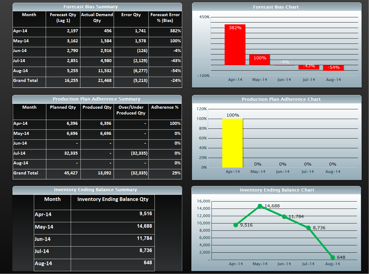
A screenshot of a spreadsheet in Microsoft Excel. It is divided into four sections.
The first section on the top left shows a table with three columns and three rows. The first column is titled "Production Plan Adherence Summary" and the second column is labeled "Inventory Ending Balance Summary". The table has three columns each representing a different stage of the production plan.
In the top right section there is a bar graph with a red line representing the forecast bias summary. The graph shows that the forecast has been steadily increasing over time with a slight decrease in the number of days of the week. The second column has a yellow line representing a percentage of the total production plan adherence. The third column has two bars one in red and one in yellow representing the percentage of production. The fourth column has three bars in green representing an inventory ending balance summary and the fifth column has four bars in yellow. The chart shows a downward trend indicating a decrease in inventory ending.

Category
-
Date
2014
Collection
We encourage you to view the image in the context of its source document(s) and cite the source(s) when using these images. However, to cite just this image alone, click the “Cite This Image” button and then paste the copied text.


