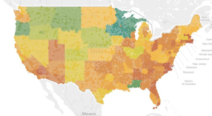
OIDA Image Collection
Filters:
Reset 
A map of the United States showing the percentage of people living in each state. The map is color-coded with different shades of orange representing different areas of the country. The colors range from light green to dark green with some areas in orange and others in yellow. The states are labeled with their names such as New York New Jersey Massachusetts Rhode Island Connecticut Delaware Maryland and the District of Columbia. The map also shows the major cities and towns within each state including New York City New York State and New York. The majority of the states are in orange while the majority are in green indicating that they are in the western part of the state. There are also some states in yellow indicating a decrease in population density. The image also includes a legend at the bottom that explains the colors used in the map.

Description Generated using AI

A map of the United States showing the percentage of people living in each state. The map is color-coded with different shades of orange representing different areas of the country. The colors range from light green to dark green with some areas in orange and others in yellow. The states are labeled with their names such as New York New Jersey Massachusetts Rhode Island Connecticut Delaware Maryland and the District of Columbia. The map also shows the major cities and towns within each state including New York City New York State and New York. The majority of the states are in orange while the majority are in green indicating that they are in the western part of the state. There are also some states in yellow indicating a decrease in population density. The image also includes a legend at the bottom that explains the colors used in the map.

Type Generated using AI

We encourage you to view the image in the context of its source document(s) and cite the source(s) when using these images. However, to cite just this image alone, click the “Cite This Image” button and then paste the copied text.

Information copied to your clipboard:

"A map of the United States showing the percentage of people living in each state. The map is color-coded with different shades of orange representing...