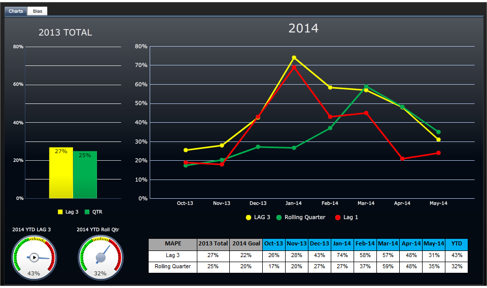
A data visualization consisting of a bar chart a run chart 2 dials and a table. The bar chart compares Lag 3 (27%) to QTR (25%) for 2013 TOTAL. The run chart compares LAG 3 (in yellow) to Rolling Quarter (in green) to Lag 1 (in red) expressed as percentages spanning from October 2013 to May 2014 (in monthly intervals). The first dial shows 2014 YTD LAG 3 (43%). The second dial shows 2014 YTD Roll Qtr (32%). The table compares Lag 3 to Rolling Quarter spanning from October 2013 to May 2014 (in monthly intervals) plus 2013 Total 2014 Goal and YTD all expressed as percentages. The background is black and white with graphic elements in yellow green red gray blue and white with text in white and black.
Source 1 of 2
-
Date
2007
Collection
-
Date
2014
Collection
We encourage you to view the image in the context of its source document(s) and cite the source(s) when using these images. However, to cite just this image alone, click the “Cite This Image” button and then paste the copied text.
