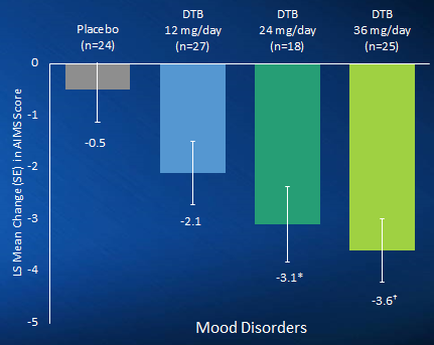
OIDA Image Collection
Filters:
Reset 
A bar graph that shows the mean change in mood disorders in the United States. The x-axis of the graph is labeled "Placebo" and the y-axis is labeled as "DTB". There are three bars in the graph each representing a different mood disorder. The first bar represents Placebo (n=24) the second bar represents 12 mg/day (n-27) and the third bar represents DTB (dtb) (dibs). The bars are arranged in a horizontal line with the first bar representing Placebo on the left side and the second and third bars representing DTB on the right side. The first bar on the graph shows that Placebo has a higher mean change than DTB with a lower mean change. The second bar shows that DTB is the highest mean change with an increase in DTB and DTB. The third bar shows a decrease in debt with DTB having a higher percentage of DTB than debt. The fourth bar shows the lowest mean change from DTB to DTB in the first and second bars. The fifth bar shows an increase from debt to debt in the third and fourth bars. -3.1* -3.6* -2.1". The graph also has a legend at the bottom that explains the meaning of each bar.

Description Generated using AI

A bar graph that shows the mean change in mood disorders in the United States. The x-axis of the graph is labeled "Placebo" and the y-axis is labeled as "DTB". There are three bars in the graph each representing a different mood disorder. The first bar represents Placebo (n=24) the second bar represents 12 mg/day (n-27) and the third bar represents DTB (dtb) (dibs). The bars are arranged in a horizontal line with the first bar representing Placebo on the left side and the second and third bars representing DTB on the right side. The first bar on the graph shows that Placebo has a higher mean change than DTB with a lower mean change. The second bar shows that DTB is the highest mean change with an increase in DTB and DTB. The third bar shows a decrease in debt with DTB having a higher percentage of DTB than debt. The fourth bar shows the lowest mean change from DTB to DTB in the first and second bars. The fifth bar shows an increase from debt to debt in the third and fourth bars. -3.1* -3.6* -2.1". The graph also has a legend at the bottom that explains the meaning of each bar.

We encourage you to view the image in the context of its source document(s) and cite the source(s) when using these images. However, to cite just this image alone, click the “Cite This Image” button and then paste the copied text.

Information copied to your clipboard:

"A bar graph that shows the mean change in mood disorders in the United States. The x-axis of the graph is labeled "Placebo" and the y-axis ...