


Title
Description
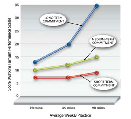
This is a line chart showing the relationship between average weekly practice time on a band instrument by student musicians (on the x-axis) and their score on the Watkins-Farnum Performance Scale (on the y-axis) as informed by their level of commitment (whether Short-term Medium-term or Long-term). The data shows that WFPS scores improve as practice time increases (regardless of level of commitment) and also that WFPS scores improve as level of commitment increases (regardless of amount of practice time) with the best scores arising from the pairing of high practice time with high level of commitment (unsurprisingly). The relevance of these trends outside their original context - to measure music sight-reading ability based on errors in notes rhythms and articulations - is debatable unless one abstracts it to "working hard and caring a lot yields the best results".
Type 
Category
Source 1 of 2
-
Date
2012
Collection
-
Date
2013
Collection
We encourage you to view the image in the context of its source document(s) and cite the source(s) when using these images. However, to cite just this image alone, click the “Cite This Image” button and then paste the copied text.