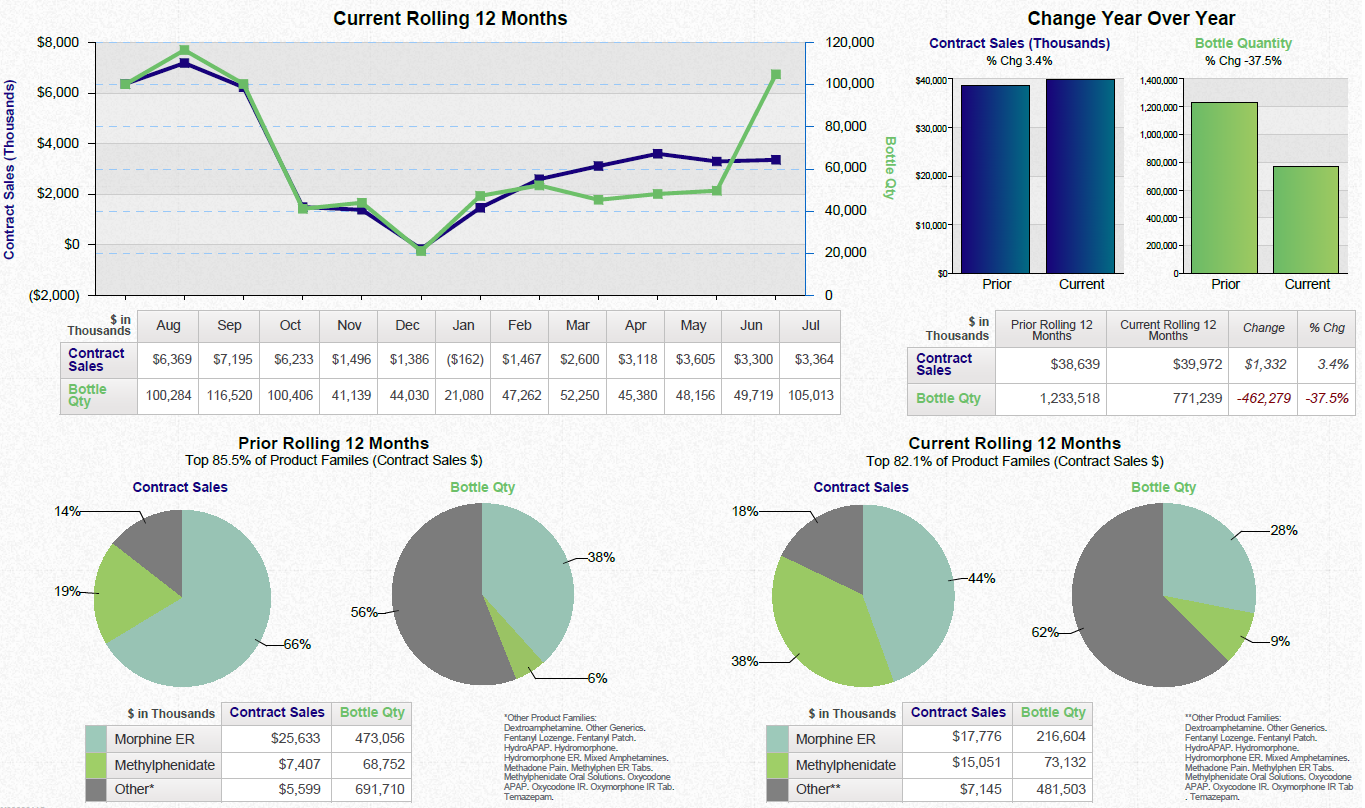
A line graph that shows the current year-to-date vs. prior year to-date of a product. The x-axis represents the months of the year starting from August to September and ending at September.
The graph has three lines each representing a different period of time. The first line is blue the second line is green and the third line is purple. The lines are plotted in a horizontal axis with the blue line representing the current period and the green line representing a previous period. The graph shows that the product has been steadily increasing over the years with a slight decline in the price over the past few months. The blue line represents the price of the product while the purple line represents a slight decrease in the current price.
There are two bars in the graph one in green and one in blue which represent the price and the other in blue. The green bar represents the quantity of the quantity which is higher than the blue bar. The bars are labeled with the corresponding price and quantity and there is a legend at the bottom of the graph that explains the meaning of each bar.
-
Date
2015
Collection
We encourage you to view the image in the context of its source document(s) and cite the source(s) when using these images. However, to cite just this image alone, click the “Cite This Image” button and then paste the copied text.