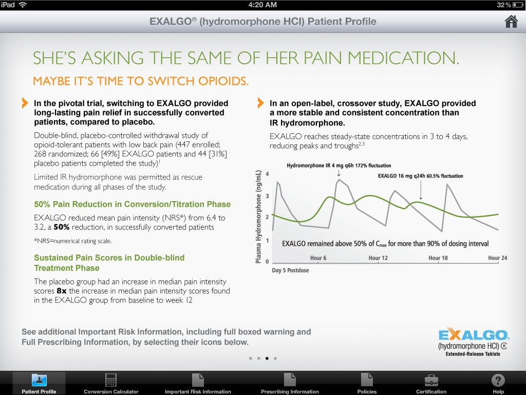
A screenshot of the Exalgo Hydromorphone HCI Patient Profile page on an iPad. The page is titled "She's asking the same of her pain medication. Maybe it's time to switch opioids."
The page has a white background with black text. On the left side of the page there is a title that reads "In the pivotal trial switching to EXALGO provided long-lasting pain relief to successfully converted patients compared to placebo." Below the title there are several paragraphs summarizing the study findings.
On the right side of this page there is a title reading "In an open-label crossover study EXALGO provided a more stable and consistent concentration than IR hydromorphone". Below the title there is a sentence reading "EXALGO reaches steady-state concentrations in 3 to 4 days reducing peaks and troughs." Below this there is a line graph illustrating this. The x-axis shows time starting at Day 5 Postdose with 6 hour increments. The y-axis shows Plasma hydromorphone (ng/mL). The lines show Exalgo as having values between 2 and 3 with a fluctuation of 60.5% whereas the hydromorphone IR has values between 1 and 4 with a 172% fluctuation. The bottom right corner of the page shows the Exalgo logo.
Description
Category
Source 1 of 21
-
Date
2012
Collection
-
Date
2011
Collection
-
Date
2012
Collection
-
Date
2011
Collection
-
Date
2011
Collection
-
Date
2011
Collection
-
Date
2012
Collection
-
Date
2011
Collection
-
Date
2012
Collection
-
Date
2011
Collection
-
Date
2012
Collection
-
Date
2011
Collection
-
Date
2011
Collection
-
Date
2012
Collection
-
Date
2011
Collection
-
Date
2012
Collection
-
Date
2011
Collection
-
Date
2011
Collection
-
Date
2011
Collection
-
Date
2011
Collection
-
Date
2012
Collection
We encourage you to view the image in the context of its source document(s) and cite the source(s) when using these images. However, to cite just this image alone, click the “Cite This Image” button and then paste the copied text.

