


Title
Description
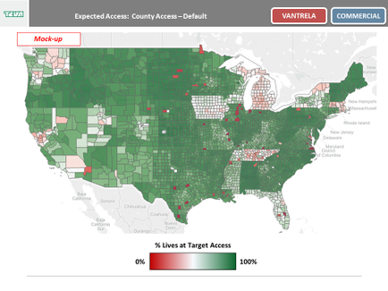
This is a choropleth map of the continental United States showing the percentage of Lives at Target Access for Vantrela ER (hydrocodone bitartrate) an opioid sold by Teva Pharmaceuticals. Individual counties within each state are colored in various shades of red and green. Darkest green indicates that a given county is at 100% of target access (meaning that 100% of chronic pain patients therefore potential customers of this Teva drug have access to Vantrela); darkest red indicates that a given county is at 0% of target access (meaning that 100% of chronic pain patients therefore potential customers of this Teva drug do not have access to Vantrela).
Type 
Category
Source 1 of 2
-
Date
2017
Collection
-
Date
2018
Collection
We encourage you to view the image in the context of its source document(s) and cite the source(s) when using these images. However, to cite just this image alone, click the “Cite This Image” button and then paste the copied text.