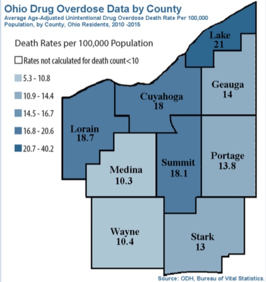
A map of Ohio drug overdose data by county. It shows the average age-adjusted unintentional drug overdose death rate per 100000 population in the state of Ohio from 2010 to 2015. The map is divided into different regions each representing a different population.
The map is color-coded with the majority of the counties in blue representing the population and the majority in gray representing the death rates per 100 million population. The counties are labeled with their respective death rates ranging from 5.3-10.8 to 10.9-14.4. The death rates are not calculated for death count as indicated by the text on the map.
There are also several smaller regions in the map including Lake 21 Cuyahoga 18 Lorain 18 Medina 10.3 Summit 18.1 and Portage 13.8. These regions are labeled as "Wayne 10.4" and "Stark 13." The map also includes a legend at the bottom that explains the meaning of each region.
Category
Source 1 of 2
-
Date
2017
Collection
-
Date
2017
Collection
We encourage you to view the image in the context of its source document(s) and cite the source(s) when using these images. However, to cite just this image alone, click the “Cite This Image” button and then paste the copied text.
