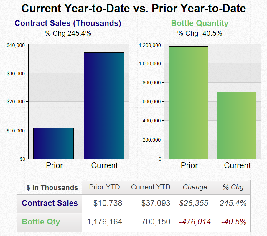
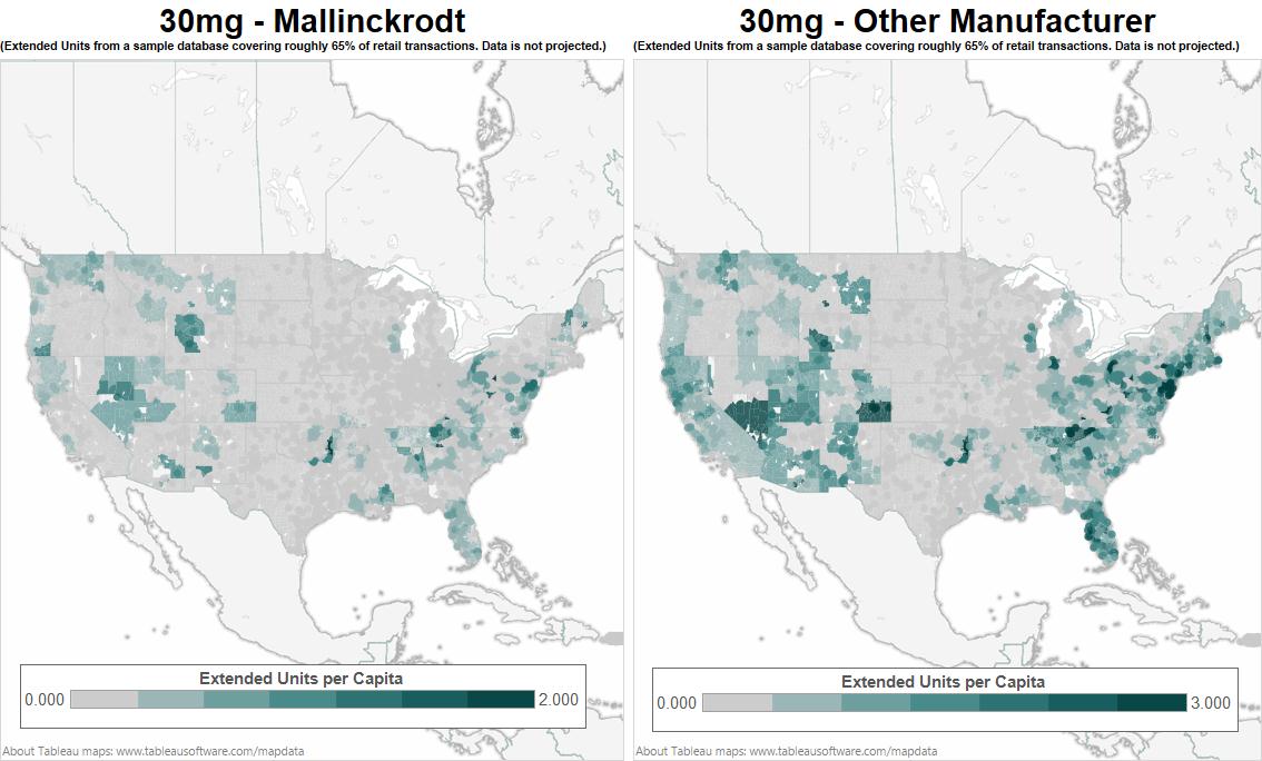
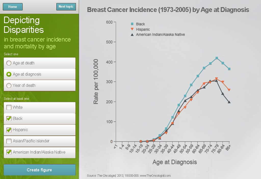
A line graph that shows the percentage of breast cancer incidence in the United States from 1973-2005 by age at diagnosis. The x-axis represents the years from 1973 to 2005 with the y-axis representing the age range.
The graph is divided into two sections. On the left side there is a title that reads "Depicting Disparities in Breast Cancer Incidence and Mortality by Age". Below the title there are two options - "Select one" and "Create figure".
On the right side of the graph there has a legend that explains the meaning of each color. The first option is "Age at diagnosis" and the second option is labeled "Year of death". The line graph shows that the age ranges from around 100000 to around 200000 years with a higher percentage of deaths than the rest of the population. The graph also has a label that says "American Indian/Alaska Native" and a link to a website for more information about the data.
Source 1 of 2
-
Date
2011
Collection
-
Date
2011
Collection
We encourage you to view the image in the context of its source document(s) and cite the source(s) when using these images. However, to cite just this image alone, click the “Cite This Image” button and then paste the copied text.

