


Title
Description
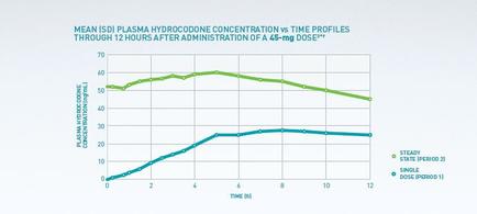
This is a run chart with Time (from 0 to 12 hours) on the x-axis and Plasma hydrocodone concentration (in mg/mL) on the y-axis. The data shows that Single Dose (Period 1) takes 7 hours to build from 0 mg/mL to 28 mg/ML which it holds for hours 7-12. The data also shows that Steady State (Period 2) takes 3 hours to build from 52 mg/mL to 60 mg/ML which it holds for hours 3-6 before steadily declining (to 45 mg/mL at hour 12).
Type 
Category
-
Date
2015
Collection
We encourage you to view the image in the context of its source document(s) and cite the source(s) when using these images. However, to cite just this image alone, click the “Cite This Image” button and then paste the copied text.


![A flow chart with the title "Please work through the following steps within the physician office". It consists of 2 questions with 3 answers each (If No If Yes and [Exceptional Circumstances Requiring an Escalation Form]). Question 1 is "Has the office ePrescribing software been updated with the latest compendia/script data (either automatically via online download manually or by data upload?". Question 2 is "Has the Prescriber's device (handheld PC etc.) been updated with the latest eRx data from their software provider?" Both the questions and the answers seem to indicate that this workflow is intended for employees of Mallinckrodt working on the technological aspects of Prescription Issues. The background is purple with a green stripe with graphic elements in green and teal with text in white.](https://oida-resources-images.azureedge.net/public/full/f9c4cc8a-fa9c-4b12-bb65-5d6098e776b8.jpeg)