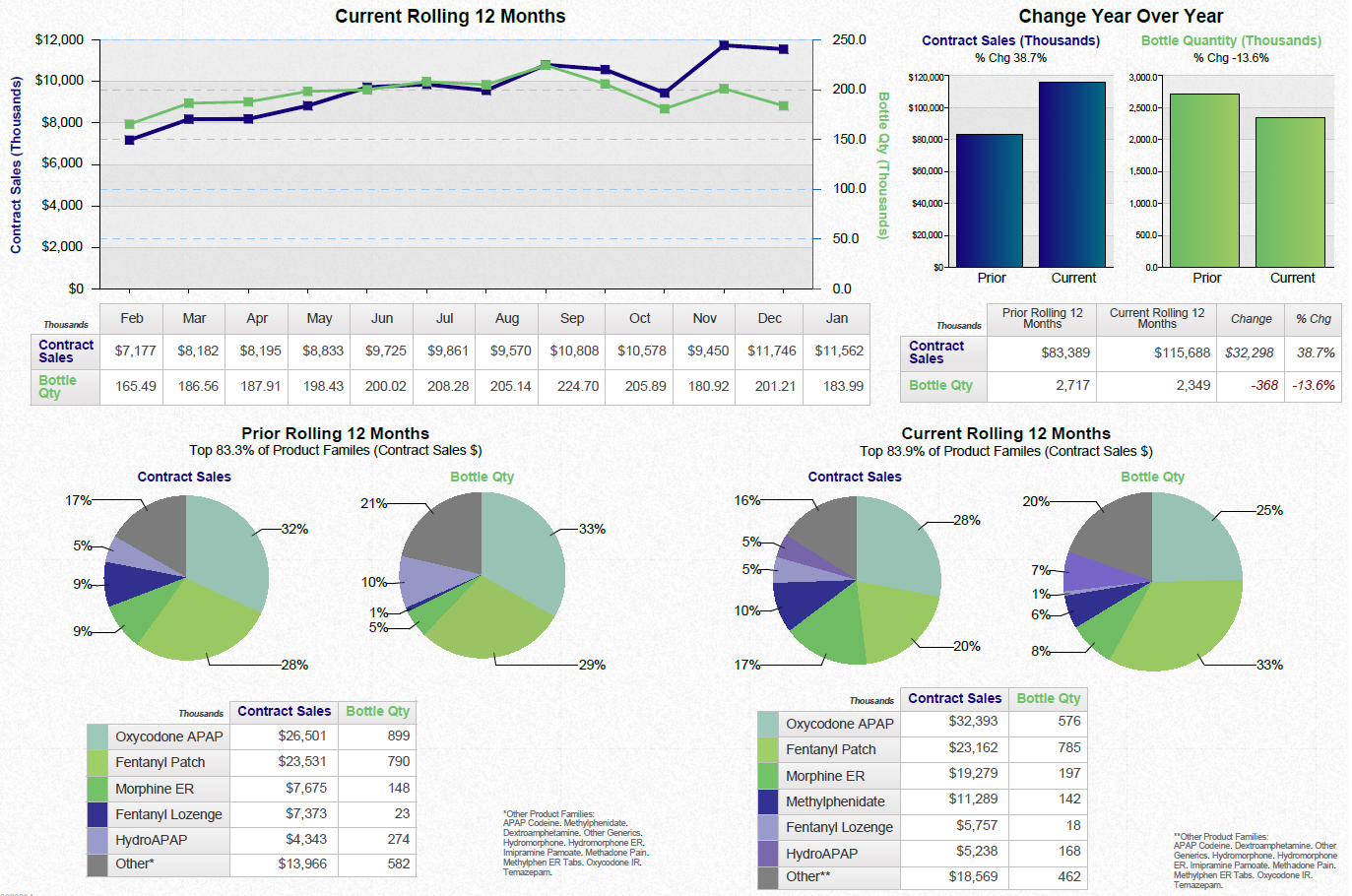
OIDA Image Collection
Filters:
Reset 
A bar graph that shows the copay distribution by drug. The x-axis of the graph is labeled "Copay Distribution by Drug" and the y-axis is labeled as "Amount of Copay Distribution". The graph shows that the amount of copay in each drug is represented by a different color. There are six bars in the graph each representing a different category. The first bar is labeled with the name of the category the second bar is colored in red the third bar is orange the fourth bar is yellow the fifth bar is green the sixth bar is purple and the seventh bar is blue. The bars are arranged in a horizontal line with the highest bar at the top and the lowest at the bottom. The first bar on the left side of the chart shows that there are approximately 10% of the COPay distributions by drug ranging from 0% to 100%. The second bar in the middle shows that it is the highest with 10% being the lowest. The third and fourth bars on the right side show that there is a higher percentage of the total copay distributions. The fifth and sixth bars show that the highest percentage is the lowest with 50% being around 100%. Overall the graph provides a visual representation of the distribution of COPay by drug in different categories.

Description Generated using AI

A bar graph that shows the copay distribution by drug. The x-axis of the graph is labeled "Copay Distribution by Drug" and the y-axis is labeled as "Amount of Copay Distribution". The graph shows that the amount of copay in each drug is represented by a different color. There are six bars in the graph each representing a different category. The first bar is labeled with the name of the category the second bar is colored in red the third bar is orange the fourth bar is yellow the fifth bar is green the sixth bar is purple and the seventh bar is blue. The bars are arranged in a horizontal line with the highest bar at the top and the lowest at the bottom. The first bar on the left side of the chart shows that there are approximately 10% of the COPay distributions by drug ranging from 0% to 100%. The second bar in the middle shows that it is the highest with 10% being the lowest. The third and fourth bars on the right side show that there is a higher percentage of the total copay distributions. The fifth and sixth bars show that the highest percentage is the lowest with 50% being around 100%. Overall the graph provides a visual representation of the distribution of COPay by drug in different categories.

We encourage you to view the image in the context of its source document(s) and cite the source(s) when using these images. However, to cite just this image alone, click the “Cite This Image” button and then paste the copied text.

Information copied to your clipboard:

"A bar graph that shows the copay distribution by drug. The x-axis of the graph is labeled "Copay Distribution by Drug" and the y-axis is la...