


Title
Description
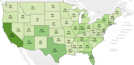
This is an untitled map of the continental United States color-coded in various shades of green. States with higher numbers are in darker green (ex : 3.538K for California) while states with lower numbers are in lighter green (ex : 8K for Wyoming); there also percentages listed for each state ranging from 4% to 6%. The numbers may refer to TRx (total prescriptions filled) for an unnamed drug with the percentages referring to its market share.
Type 
Category
Source 1 of 4
-
Date
2017
Collection
-
Date
2017
Collection
-
Date
2017
Collection
-
Date
2017
Collection
We encourage you to view the image in the context of its source document(s) and cite the source(s) when using these images. However, to cite just this image alone, click the “Cite This Image” button and then paste the copied text.