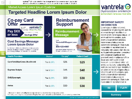
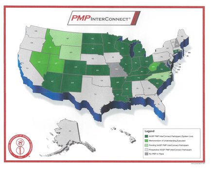
OIDA Image Collection
Filters:
Reset 
A map of the United States of America with each state outlined in green and blue. The map is color-coded to show the percentage of people living in each state with the majority of the states in green representing the highest percentage and the majority in blue representing the lowest percentage. The map also includes a legend that explains the different colors used in the map. The colors range from light green to dark blue with some areas in darker blue representing higher percentages and others in light green representing lower percentages. The legend also includes information about the PMP Interconnect program which is a program that provides information on how to connect with PMP interconnects in the US. The image also has a red border around the edges with a logo of the company in the top left corner.

Description Generated using AI

A map of the United States of America with each state outlined in green and blue. The map is color-coded to show the percentage of people living in each state with the majority of the states in green representing the highest percentage and the majority in blue representing the lowest percentage. The map also includes a legend that explains the different colors used in the map. The colors range from light green to dark blue with some areas in darker blue representing higher percentages and others in light green representing lower percentages. The legend also includes information about the PMP Interconnect program which is a program that provides information on how to connect with PMP interconnects in the US. The image also has a red border around the edges with a logo of the company in the top left corner.

Type Generated using AI

Category

We encourage you to view the image in the context of its source document(s) and cite the source(s) when using these images. However, to cite just this image alone, click the “Cite This Image” button and then paste the copied text.

Information copied to your clipboard:

"A map of the United States of America with each state outlined in green and blue. The map is color-coded to show the percentage of people living in e...