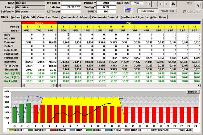
OIDA Image Collection
Filters:
Reset 
A bar graph that shows the total health expenditure as a share of GDP in the United States from 2009 to 2009. The x-axis represents the years starting from 2009 and ending in 2009 with the y-axis representing the number of health expenditures. There are six bars in the graph each representing a different country - public private and private. The public bars are blue the private bars are red and the private bar is orange. The bars are arranged in ascending order with each bar representing a year. The highest bar represents the percentage of health expenditure while the lowest bars represent the percentage. The graph shows that the majority of the health expenditures in each country have a higher percentage of public and private health expenditures than the rest of the country. The data is presented in a table format with a title at the top that reads "Total Health Expenditure as a Share of GDP 2009".

Description Generated using AI

A bar graph that shows the total health expenditure as a share of GDP in the United States from 2009 to 2009. The x-axis represents the years starting from 2009 and ending in 2009 with the y-axis representing the number of health expenditures. There are six bars in the graph each representing a different country - public private and private. The public bars are blue the private bars are red and the private bar is orange. The bars are arranged in ascending order with each bar representing a year. The highest bar represents the percentage of health expenditure while the lowest bars represent the percentage. The graph shows that the majority of the health expenditures in each country have a higher percentage of public and private health expenditures than the rest of the country. The data is presented in a table format with a title at the top that reads "Total Health Expenditure as a Share of GDP 2009".

We encourage you to view the image in the context of its source document(s) and cite the source(s) when using these images. However, to cite just this image alone, click the “Cite This Image” button and then paste the copied text.

Information copied to your clipboard:

"A bar graph that shows the total health expenditure as a share of GDP in the United States from 2009 to 2009. The x-axis represents the years startin...