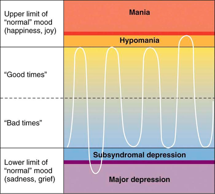
OIDA Image Collection
Filters:
Reset 
A graph that shows the relationship between Mania and Hypomania. The graph is divided into three sections each representing a different level of happiness. The top section is labeled "Upper limit of normal" mood (happiness joy) and the bottom section is titled "Good times" and "Bad times". The graph shows that Mania is higher in normal mood and has a higher level of sadness grief and depression. The middle section is labelled "Subsyndromal depression" and shows that the majority of Mania has a lower level of depression while the majority has a major depression. There are three lines in the graph each with a different color - orange yellow and blue. The orange line represents Mania's happiness the yellow line represents Good times and the blue line represents Bad times. The lines represent Bad times the red line represents Subsyndromeal depression and both lines represent Major depression.

Description Generated using AI

A graph that shows the relationship between Mania and Hypomania. The graph is divided into three sections each representing a different level of happiness. The top section is labeled "Upper limit of normal" mood (happiness joy) and the bottom section is titled "Good times" and "Bad times". The graph shows that Mania is higher in normal mood and has a higher level of sadness grief and depression. The middle section is labelled "Subsyndromal depression" and shows that the majority of Mania has a lower level of depression while the majority has a major depression. There are three lines in the graph each with a different color - orange yellow and blue. The orange line represents Mania's happiness the yellow line represents Good times and the blue line represents Bad times. The lines represent Bad times the red line represents Subsyndromeal depression and both lines represent Major depression.

We encourage you to view the image in the context of its source document(s) and cite the source(s) when using these images. However, to cite just this image alone, click the “Cite This Image” button and then paste the copied text.

Information copied to your clipboard:

"A graph that shows the relationship between Mania [...]." OIDA Image Collection. Available at https://images.oida-resources.jhu.edu/8920b64b-122f-49f...