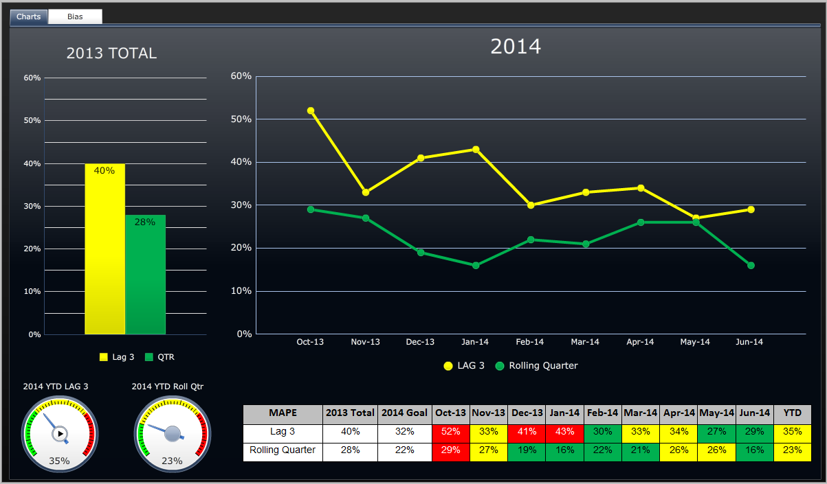
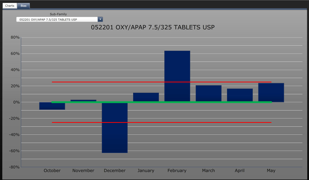
A bar graph that shows the number of OXY/APAP 7.5/325 tablets USP in the United States from October to May. The x-axis represents the months of the year starting from October November December January February March April and May.
The graph has three bars each representing a different month. The first bar is blue the second is green and the third is red. The bars are arranged in a horizontal axis with the highest bar at the top and the lowest at the bottom. The highest bar is orange the middle bar is yellow the lowest bar is red and all the bars are blue. The graph shows that the OXY and APAP tablets have been steadily increasing over the years with a slight decline in the percentage of OXO and APAPI tablets.
Category
-
Date
2014
Collection
We encourage you to view the image in the context of its source document(s) and cite the source(s) when using these images. However, to cite just this image alone, click the “Cite This Image” button and then paste the copied text.


