OIDA Image Collection
Filters:
Reset 
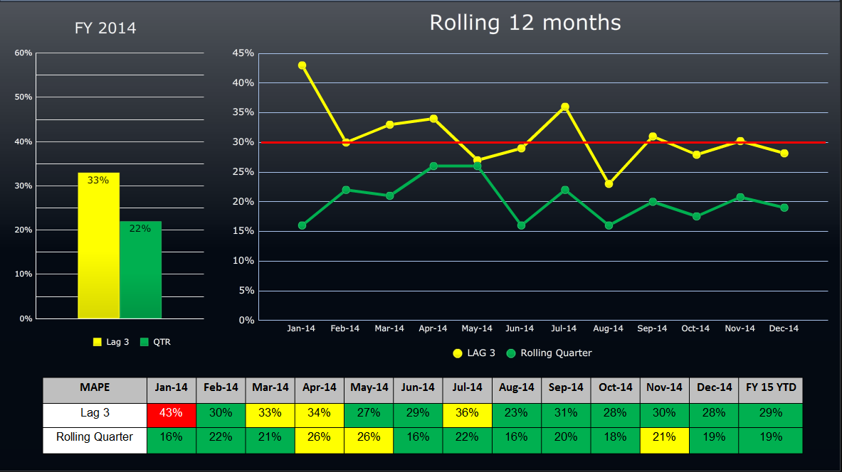
A line graph that shows the rolling 12 months of FY 2014. The x-axis represents the years from January 2014 to December 2014 with the y-axis representing the rolling quarters.<br /><br />There are three lines in the graph each representing a different period of time. The first line is yellow the second line is green and the third line is red. The lines are plotted in a horizontal axis with each line representing a month of the year. The yellow line is slightly higher than the green line indicating a decrease in the number of rolling quarters over the years. The red line is lower than the yellow line representing a decrease of the rolling quarter over the past 12 months. The green line is longer than the red line and it is steadily increasing indicating an increase in rolling quarters for the first quarter of 2014. <br /><br />At the bottom of the image there is a table that shows that the data was presented in a table format with columns for the date month and year as well as the percentage change in the percentage. The table also includes a legend that explains the meaning of each line.

Description Generated using AI

A line graph that shows the rolling 12 months of FY 2014. The x-axis represents the years from January 2014 to December 2014 with the y-axis representing the rolling quarters.

There are three lines in the graph each representing a different period of time. The first line is yellow the second line is green and the third line is red. The lines are plotted in a horizontal axis with each line representing a month of the year. The yellow line is slightly higher than the green line indicating a decrease in the number of rolling quarters over the years. The red line is lower than the yellow line representing a decrease of the rolling quarter over the past 12 months. The green line is longer than the red line and it is steadily increasing indicating an increase in rolling quarters for the first quarter of 2014.

At the bottom of the image there is a table that shows that the data was presented in a table format with columns for the date month and year as well as the percentage change in the percentage. The table also includes a legend that explains the meaning of each line.

We encourage you to view the image in the context of its source document(s) and cite the source(s) when using these images. However, to cite just this image alone, click the “Cite This Image” button and then paste the copied text.

Information copied to your clipboard:

"A line graph that shows the rolling 12 months of FY 2014. The x-axis represents the years from January 2014 to December 2014 with the y-axis represen...