


Title
Description 
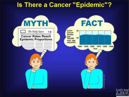
This is a cartoon comparing a Myth ("Cancer rates reach epidemic proportions") to the Facts (a run chart showing that colon cancer deaths per 100000 men when adjusted for age were stable between 1940 and 1990). The subtext is that people are unduly persuaded by numbers lacking context and do not practice sufficient information literacy (especially in matters mathematical). A higher total number of cancer deaths should be assumed in a society with a growing population where cancer is more likely to be accurately diagnosed where cancer-related fatalities are more likely to properly recorded and reported etc.
Type
Category
Source 1 of 12
-
Date
None
Collection
-
Date
2011
Collection
-
Date
2011
Collection
-
Date
2011
Collection
-
Date
2011
Collection
-
Date
2011
Collection
-
Date
2011
Collection
-
Date
2011
Collection
-
Date
2011
Collection
-
Date
2011
Collection
-
Date
2011
Collection
-
Date
2011
Collection
We encourage you to view the image in the context of its source document(s) and cite the source(s) when using these images. However, to cite just this image alone, click the “Cite This Image” button and then paste the copied text.