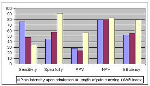
An untitled bar graph. The x-axis of the graph has five sections labeled: "Sensitivity" "Specificity" "PPV" "NPV" and "Efficiency". The y-axis shows a range of values between 0 and 100. Each section of the x-axis has three bars above it. The key shows that the purple bars represent percentage of pain intensity upon admission the red bars represent the length of pain suffering and the yellow bars represent the WR Index.
Category
-
Date
2009
Collection
We encourage you to view the image in the context of its source document(s) and cite the source(s) when using these images. However, to cite just this image alone, click the “Cite This Image” button and then paste the copied text.


