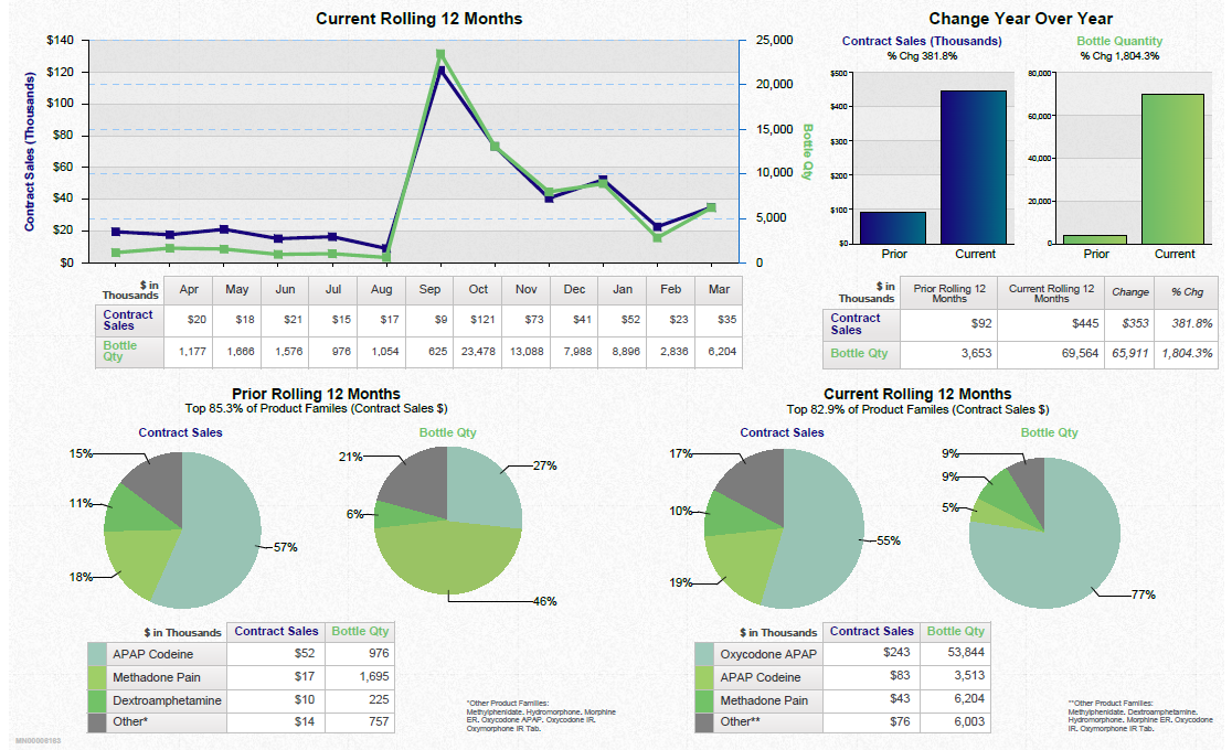
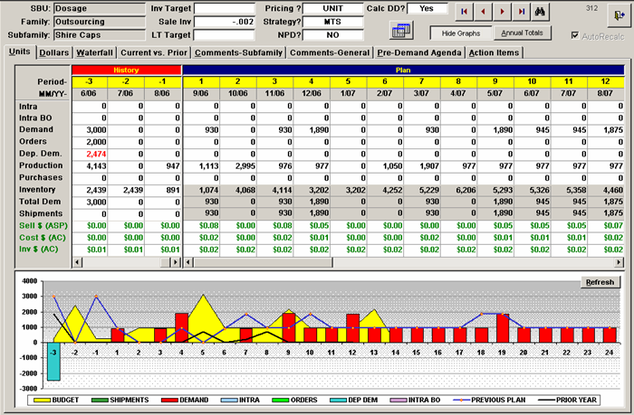
A screenshot of a spreadsheet in Microsoft Excel. The spreadsheet is divided into two columns and two rows. The first column is titled "SUBU" and the second column is labeled "Dosage".
The first row of the spreadsheet has a table with columns for the date time and price of the product. The table has rows for the product name quantity and other relevant information. The second row has columns for quantity price and quantity. The third row has a column for quantity and quantity with the quantity at the top and the quantity in the middle.
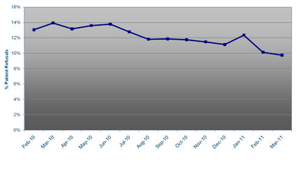
At the bottom of the table there is a line graph that shows the price and quantity of different products. The line graph is colored in red yellow and green representing the different types of products and their respective prices. The graph also has a bar graph at the bottom which shows the percentage of products sold in each category. The data is presented in a table format with each row representing a different type of product and the corresponding price. There are also several buttons on the top right corner of the screen including "Save" "Cancel" and "Help".
Category
-
Date
2006
Collection
We encourage you to view the image in the context of its source document(s) and cite the source(s) when using these images. However, to cite just this image alone, click the “Cite This Image” button and then paste the copied text.

