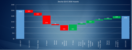
OIDA Image Collection
Filters:
Reset 
A bar graph that shows the impact of security Q1/2 2016 impacts on the security of a company. The x-axis represents the years from 2016 to 2016 and the y-axis indicates the number of impacts. There are six bars in the graph each representing a different year. The first bar is red the second is green the third is orange the fourth is yellow the fifth is red and the sixth is green. The bars are arranged in a horizontal line with the highest bar at the top and the lowest at the bottom. The highest bar is blue the middle bar is green and the shortest bar is yellow. The lowest bar is orange and the highest is red. The graph shows that the company has experienced a significant increase in security over the years with a slight decrease in the impact on its security. The impact on the company's security has increased from $1000 to $2000 in 2016.

Description Generated using AI

A bar graph that shows the impact of security Q1/2 2016 impacts on the security of a company. The x-axis represents the years from 2016 to 2016 and the y-axis indicates the number of impacts. There are six bars in the graph each representing a different year. The first bar is red the second is green the third is orange the fourth is yellow the fifth is red and the sixth is green. The bars are arranged in a horizontal line with the highest bar at the top and the lowest at the bottom. The highest bar is blue the middle bar is green and the shortest bar is yellow. The lowest bar is orange and the highest is red. The graph shows that the company has experienced a significant increase in security over the years with a slight decrease in the impact on its security. The impact on the company's security has increased from $1000 to $2000 in 2016.

We encourage you to view the image in the context of its source document(s) and cite the source(s) when using these images. However, to cite just this image alone, click the “Cite This Image” button and then paste the copied text.

Information copied to your clipboard:

"A bar graph that shows the impact of [...]." OIDA Image Collection. Available at https://images.oida-resources.jhu.edu/9f3a4567-f231-4f24-8ddc-ab1c99...