Title
Description
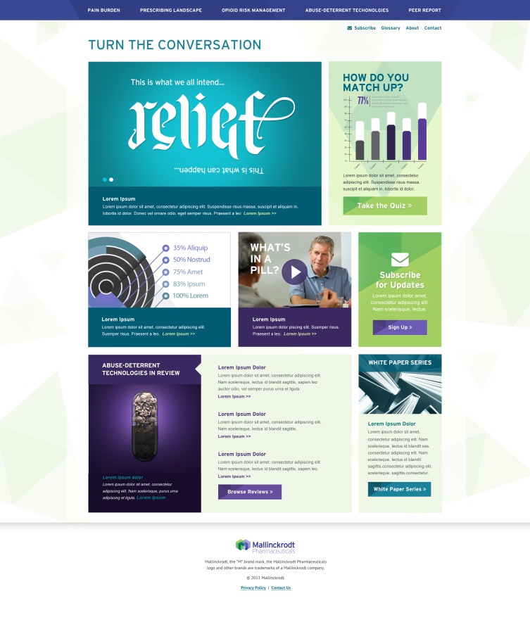
A screenshot of the homepage of the Turn the Conversation website sponsored by Mallinckrodt Pharmaceuticals (c2013). It consists of two menu bars at the top with 8 clickable sections in the middle with the logo of Mallinckrodt Pharmaceuticals at the bottom. The sections include infographics images clip art etc. The background is white with graphic elements in purple green and teal with text in white purple teal and black.
Type
Source 1 of 3
-
Date
2013
Collection
-
Date
2013
Collection
-
Date
2013
Collection
We encourage you to view the image in the context of its source document(s) and cite the source(s) when using these images. However, to cite just this image alone, click the “Cite This Image” button and then paste the copied text.
