Title
Description
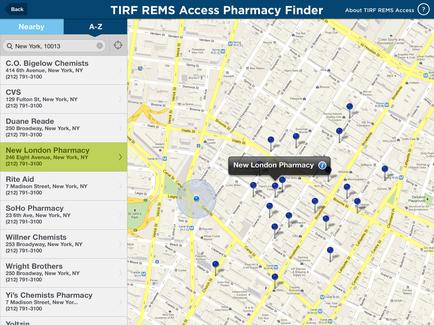
This is a bubble graph explaining user behavior on the websites for 10 different television channels. The x-axis tracks the Engagement (Visits per person) the y-axis tracks Sticky time (Average time spent per person in minutes) and the bubble size tracks the number of visitors (presumably). The website for the Food Network is a clear outlier in good ways : it has the most visits per person (2.10) the third-highest sticky time (14 minutes per visit) and the most visitors (that is the largest bubble).
Type 
Category
-
Date
2016
Collection
We encourage you to view the image in the context of its source document(s) and cite the source(s) when using these images. However, to cite just this image alone, click the “Cite This Image” button and then paste the copied text.