


Title
Description
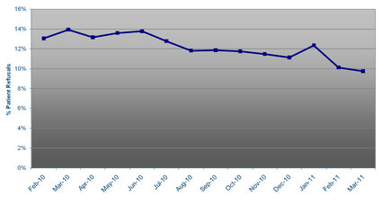
This is a run chart tracking Patient refusals (on the y-axis spanning from 0% to 16%) of an unknown drug (presumably) from February 2010 to March 2011 (on the x-axis in monthly increments). The data shows that patient refusals generally trended downward - they began at 13% (in February 2010) and ended below 10% (in March 2011). The highest value is 14% (in both March 2010 and June 2010) and the lowest value is below 10% (on March 2011) with minimal movement between any two months (with the exception of a decline from above 12% in January 2011 to above 10% in February 2011 a change of -2%).
Type 
Category
-
Date
2011
Collection
We encourage you to view the image in the context of its source document(s) and cite the source(s) when using these images. However, to cite just this image alone, click the “Cite This Image” button and then paste the copied text.