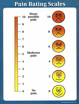
An infographic with the title "Pain Rating Scales". It shows how pain may be subjectively quantified from 0 (no pain represented by a smiley face) to 5 (moderate pain represented by a neutral face) to 10 (worst possible pain represented by a weeping face). The colors of both the scale and the faces gradually change from yellow to red as the reported pain increases. The background is white with a blue border with text in black.
Source 1 of 12
-
Date
2011
Collection
-
Date
2011
Collection
-
Date
2012
Collection
-
Date
2012
Collection
-
Date
2011
Collection
-
Date
2012
Collection
-
Date
2011
Collection
-
Date
2011
Collection
-
Date
2012
Collection
-
Date
2012
Collection
-
Date
2010
Collection
-
Date
2011
Collection
We encourage you to view the image in the context of its source document(s) and cite the source(s) when using these images. However, to cite just this image alone, click the “Cite This Image” button and then paste the copied text.
