Title
Description
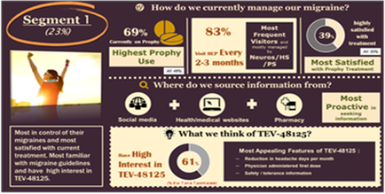
This is a data visualization consisting of 3 bar charts. The first bar chart shows Visit restrictions (ex : 35% of physicians refuse calls) the second bar chart shows Time restriction (ex : physicians allowed 1.5 minutes for an interaction in 2005 vs. 4 minutes for an interaction in 1990) and the third bar chart shows Preferred alternative resources for information (ex : 60% of physicians prefer content from an independent web site vs. sales reps medical journals company websites etc.). The trendline is that physicians are less accessible than they were in the recent past and that new approaches will likely be acquired to influence persuade and/or cajole them.
Type 
Category
-
Date
2013
Collection
We encourage you to view the image in the context of its source document(s) and cite the source(s) when using these images. However, to cite just this image alone, click the “Cite This Image” button and then paste the copied text.


![An advertisement for Xartemis XR by Mallinckrodt Pharmaceuticals from 2014. It reads "Call 888-222-9857 to locate XARTEMIS XR at a pharmacy near you" at the top. Below that there is a boxed warning that reads "Warning: Abuse potential life-threatening breathing problems unintentional experience and harmful liver effects. See full prescription information for complete warning. [etc.]"](https://oidaresourcesimages-cdn-endpoint-duhwc2gse6gdbng7.a01.azurefd.net/public/full/1085ce95-7720-4f04-ad90-75ad9af8ee10.PNG)